Product photography for your online shop
Hello! In conjunction with my Monday Mini Makeover series, I promised you all a tutorial on product photography for your online shop, and so here it is!

kaleidoscopephoto.etsy.com – toy vintage brownie
As a blog writer focusing on contemporary craft, I regularly come across lovely craft that has been photographed poorly (especially on sites like Etsy and Madeit, it has to be said!) – blurry, dark, ugly backgrounds, enormous watermarks. And it makes me really sad. Because I don’t have time to ask them to send me a better pic; I simply move onto something else.
I know photography is the bane of many creative folk selling online. We all know that a good image really helps to sell the product, but it’s a struggle just knowing how to get that magic shot. Let me just say here that when I started selling online about 4 years ago, I thought I knew everything about how to present work – after all, I did have a PhD in Fine Art, and that should mean I’d just snap a few pics and everything would be groovy.
WRONG. Quite frankly, it was embarrassing.
But more about me in a minute. Firstly, let me show you some examples of good product photography that I’ve found on Etsy and Madeit.
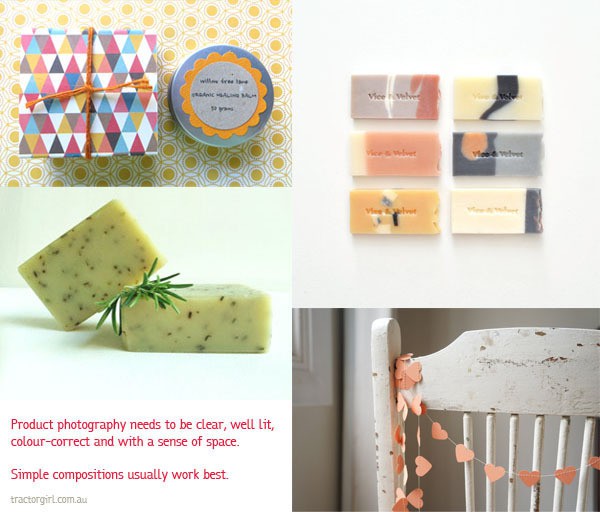
product photography
{clockwise from top left: willow tree lane – organic healing balm; vice and velvet – sniffy sample pack; penny lane studio – coral heart garland; five girls soap – rosemary lemon mint soap}
For all these products, the product is well lit with no harsh shadows; horizons and other alignment is straight, and there is ample space around the product so that the picture doesn’t look too cramped.
Accessories are kept to a minimum. The simple heart garland is placed on an old chair with great texture to add interest; a sprig of fresh rosemary is added to simple bars of soap. For the organic healing balm, pattern on pattern adds brightness. Using pattern is bit more complicated, but this works well because the yellow ties all the colours together, and the scale of the two patterns is similar.
But here’s the thing : you don’t have to have lots of props or be an amazing photographer to get a good photo.
A simple, clear shot on a white background can show off your product to its best advantage. There are some really basic, very achievable things you can do to get a good image. So, lets break it down a bit.
Composition. The first thing to remember about your photograph is that it’s in a frame, and therefore it’s a composition (remember that word from high school art classes?). So, you need to think about how to purposefully compose your photo. As noted above, don’t make your item too large in the shot (it looks cramped and uncomfortable) or too small (it looks lost) – make sure your piece has a moderate amount of space around it. Keep props to a minimum.
Lighting – If you can, photograph your item outside but not in direct sunlight, which can give really harsh shadows. Low light photography (like when you take your photographs inside) can sometimes result in graininess in your image. You can adjust it a bit in your photo-editing program, but it’s far from ideal so avoid it if you can.
Camera – I don’t have a fancy camera. It’s a very basic digital, with macro built in so I can get good close-ups of textures. Use a tripod when and where possible – NO amount of photo editing can fix a blurry photo.
Background – As a rule of thumb for product shots, the best backgrounds are plain. White is always good. The easiest thing to do is to put your piece on a sheet of plain white cardboard (less chance of it becoming creased). You can also make your own kind of “infinity ground” (cyclorama) – a gently curved background, good for covering space and useful for 3D objects. You simply need a piece of white cardboard, clip the top edge onto a heavy book, and let the remainder lay on the bench top, like I did when photographing my Poppy Seed Orange Cake. (The recipe is here – it is delish!) Then you just crop your image to suit.
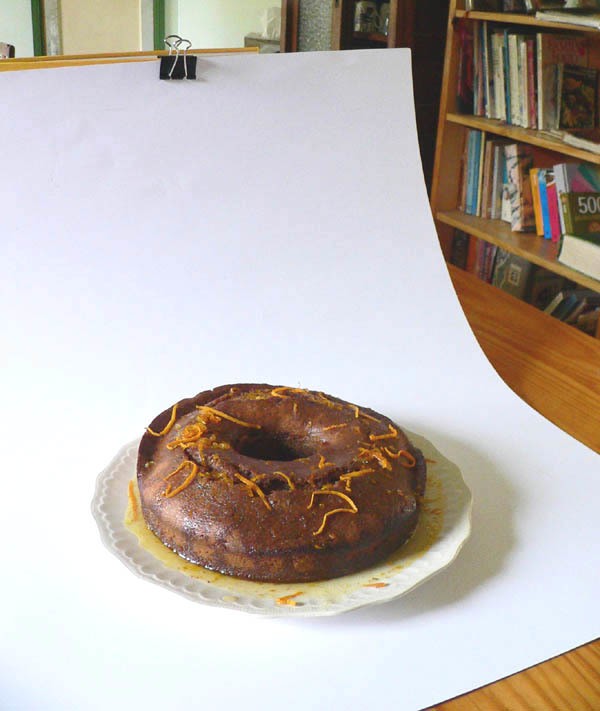
poppyseed orange cake
The trick is to make everything in your photo look like you’ve thought about it.
Editing – In my experience, most images require editing of some description. I ALWAYS adjust contrast and brightness; and the next most common thing I do is crop my images. Cropping allows you to easily get rid of extraneous detail at the edges (like the edge of the verandah, that lens cap you left on the bench…), get the proportions of image to object right, as well as allowing you to rotate the image to straighten up slightly crooked horizons. You can also change the colour balance to get rid of colour casts, and use the rubber stamp tool to get rid of minor blemishes (such as that bit of fluff you didn’t notice when you were shooting!). I use Photoshop, but if you don’t have Photoshop, there are lots of free web-based photo-editing programs out there, such as Photoscape , Fotoflexer, PicMonkey, or GIMP.
Watermarks – I completely understand that in this age of image-sharing that there is an element of the online community that like to ‘pinch’ ideas and images, or at the very least, share them profusely – and hence many makers, especially photographers, wish to put it out there that the image belongs to them. And fair enough. But PLEASE keep in mind that by blazing your name across the middle of the image in huge letters is a big turnoff! If you wish to use a watermark, that’s fine – but keep it smallish and in a corner, so that potential buyers can clearly see the work. Your image (and therefore your exposure – this is advertising, folks!) will be shared more, and you will be much more likely to be picked up by blogs and shared on social media.
Online shop limitations – For those of you who sell on Etsy, Madeit and the like, these platforms usually allow you to have around 4-5 photos – not just one. So use them! Your customers want to know what your item looks like underneath, on the reverse, inside and up close. They want to see texture, they want to know about pockets, fastenings and other details. Think about how you buy things in a shop, and what you would want to know before you bought something, and use that to guide what photos you use.
A note of warning : Your main image (the one that the customer sees first) has to look good in a thumbnail. Most of these online platforms crop your images to a standard format, and so be careful that this process doesn’t end up cropping out half your item. Mostly, they use a landscape format (the image is wider than it is high), so they tend to use the total width of your image as the width of the thumbnail, and then the top and bottom get cropped off if they’re too big. I have seen some platforms give you the option to move the image around a bit and change the cropping, so experiment, and if you can do it, use it.
Size – If you haven’t realised by now, one of the great ways to increase your audience (and your list of potential buyers) is to get people to share your image on social media – Pinterest, Twitter, Facebook, and a whole bunch more. Speaking as a blogger, if an image is much smaller than 400pixels wide, I won’t use it. My personal preference is for 500-600px wide.
Now to one of the most important aspects – Manners. If you haven’t got it by now, I’ll say it again. It’s an online world these days, and images WILL be shared. If you don’t want your images shared, don’t put them up there! And I reckon if everyone used their manners online, there would be no problems with such sharing.
Remember the Golden Rule – treat others how you would like to be treated yourself.
So, if you pin/borrow/share an image, at the very least you should provide the name of the artist, and a link back to the source where you found it. Or, even nicer is to ask permission from the artist before you share their work (something I do for all my feature artists, as I often share up to 8 of their images).
NOW. Do you wanna see some really bad photos?
tractorgirl – the early years
On the left is my first. It shows the cushion sitting on the couch in my lounge room, in my little old house with its very small windows. The image is dark – no surprise really, considering where it was taken. It also suffers quite a bit from colour cast due to the artificial light – and that can be quite tricky to correct even with clever editing. Take your images outside in indirect sunlight when possible. The cushion also takes up just about the entire composition – it’s way too big!
On the right, is a later attempt. I had a think about what I had in my house, and how I could use it. The chair is a piece I inherited from my great aunt, and it was just a matter of shifting it from the study to the hall. The pic was taken from the bedroom door across the hallway, with the front door of the house open. So, the light is better, but the door jambs are a distracting element – because of the angle of the photo they look crooked and there’s only part of one on the right anyway. The slight downward slope of the wall boards (especially noticeable in the top right) is just annoying. So make sure any background horizons are level.

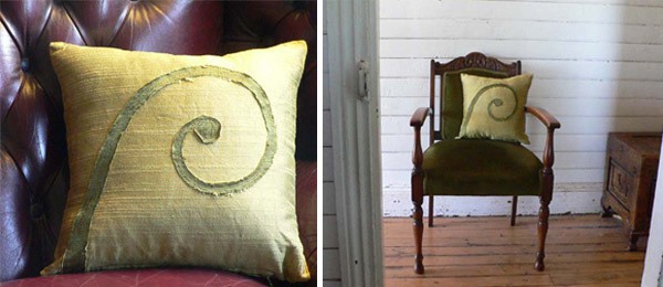
tractorgirl – red green spiral star cushion
More recently, I’ve progressed out the door onto the verandah. The chair is one of our own kitchen chairs, and that’s the front wall of our tiny old weatherboard house. Certainly the light is MUCH better. It’s a clean, simple shot (although I’d probably plump my cushion up a bit straighter). Notice also that the cushion is off centre – some photographers go for the Rule of Thirds, where the main point/s of interest are in the side or bottom (or top) third of the frame, which can make for a more interesting composition. I’m feeling a bit more confident about my photography now, so I’ve balanced the off-centre composition by including one of my cute cactuses, sitting on a thrifted stool. I love cactuses for their simple shapes, and think they’re a good foil for the more complex spiral of the cushion. As I noted above, minimal props are OK, just don’t add too much! Less is more, as they say. The background colours in this are all white or very muted; the only real colour is the cactus and the cushion.
I’m still far from fabulous! But I’m definitely a long way better than my first. It only took a couple of years. ;D
OK! Back to you.
Is there a problem with your photographs that I haven’t answered here? Something that you can’t quite put your finger on? Leave a link to your product in the comments, and I’ll do my best to make some useful suggestions. (And feel free to make comments on other people’s links too – the more feedback the better!)
Julie x
Thanks for your fantastic tips Julie. I love how you keep things simple and don’t get too technical for us ‘non-photographers’ . You have given some great advice in this article, I’ve Pinned it so I can reference it later 🙂
cheers
Grace
thanks a heap!
Great tips & advice… Nothing more annoying than a poor visual representation of a product that is being marketed!!
not only annoying, it can be quite frustrating! Cheers 🙂