Monday Mini Makeovers {part 6}
Welcome to Part SIX of Monday Mini Makeovers! That means we’ve covered quite a few shops, and helped them with a lot of business presentation issues, ESPECIALLY the visual. So if you don’t find the information you’re after in this post, I encourage you to go back through and check out the other Monday Mini Makeovers. I guarantee you’ll look at your shop with fresh eyes.
{If you want to find out more about what the Mini Makeovers are, check here.}
OK, let’s meet this week’s beautiful people and check out their shops.
Jenni from The Paper Lake
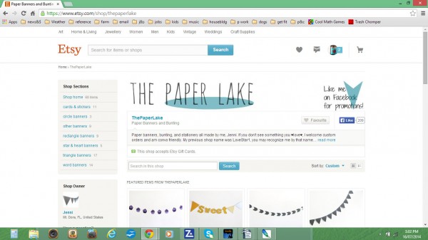
Jenni Tedman sells lots of bunting and stationery through her shop, ThePaperLake – bunting always looks so cheery, don’t you think?
First up, nice logo Jenni! Your shop banner is simple and clean, and I like the handmade feel conveyed through your choice of font.
Your photos are clear and bright; however I would say that for some shots you are too far away from the bunting – I know you’re trying to include more of the whole string, but this results in too much white space in your photos, and they end up losing the impact of your lovely colours.
Your perspective angle shots are good because they also give an idea of the close-up (colours, patterns, textures), as well as the whole string of bunting. For those simpler shots, you could also create more colour and impact by having a double string of bunting; or you could take a closer pic of just three, or five elements, so there’s not so much white space in the image, and people can see the print/texture of the paper if there is one. When you’re stuck for styling ideas, always check out the competition! What images do you like/not like from other shops that sell bunting?
For backgrounds, I also think the pics of your paper sticker stacks work well – the grey circle adds more depth/interest to image, without being distracting – it’s a clean shape and fits well with your overall aesthetic.
Don’t hide your Custom Colour Matching item on the second page! It’s a real feature of your offerings, and should be on your front page (also, change the title around a bit so that ‘Colour Matching’ is visible under the thumbnail too – every bit of awareness of what you have to offer is helpful).
And it’s nice that you’ve got a bit of a back story on your About page; it’s also good to see a variety of pics showing your materials and space and what you do. However, PLEASE don’t squash your pics! A simple two-part image with the bridal party and one perfectly matched banner would be an excellent demonstration of your colour matching.
Your policies are good and clear. And I love that you’ve said “The benefit to this is a one-on-one buying experience. My banners are not factory made.” However, I would encourage you to include something more friendly to finish with – I know you’ve told people where and how to contact you, but in sales, it’s ALWAYS about the words and where you put them!! (I am SOOO still learning all about this…) – so in Seller Information at the end, you could finish up with a friendly, “Don’t hesitate to contact me if you’ve got any questions”.
Lauren from Gears and Gadgets
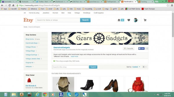
Lauren from GearsAndGadgets sells a variety of luxurious handmade bags and vintage accessories inspired by many eras.
First up Lauren, your “About” page is beautifully evocative of what you do and what inspires you! Your words totally took me to another place – you should try and include some of that in your Shop Announcement. While your SA kind of says what you do, in comparison it’s a bit vague, and it could be so much more inspiring. Because you’re appealing to a very particular group of people, be more specific and more evocative of what appeals to them – mention steampunk, magical, Victorian etc – otherwise you’re not connecting with them as well as you might. I’d probably avoid using the quotation marks on “different” too – it doesn’t need it. If you need to emphasise the quality of difference more, try some other words or phrases – e.g. for those who take the path less travelled, unusual, contrary, exotic, fantastical…. a thesaurus is your friend!
The most striking thing is – you need LOTS more products. This is especially important because you have such a variety in your shop – handmade items are only about 1/3 of your 20 or so items for sale. You must give your customers a choice; if they don’t find something similar to what they want, they won’t bother asking for a custom order – they’ll go looking in another shop.
I absolutely love all the rich fabrics and trimmings on your About photos. With the words, you could also give more of a backstory to where you’ve come from, and why you’ve chosen these areas – is it the romance? Is it just the love of rich fabrics? What’s your particular interest?
And again, like Jenni, your policies are clear and comprehensive, but perhaps make them more friendly?
Remember to always think like a customer. How do you make you customers feel when they visit your shop?? You want them to feel welcome? Use welcoming language!! 😀
Lolita from LolitaStas
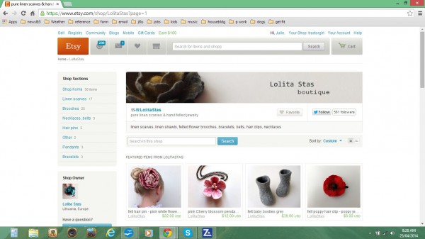
Last for today, but by no means least is Lolita Staskevidiene from LolitaStas, maker of delicious felted accessories from Lithunia.
I think Lolita’s shop is already very lovely! The items are well photographed – bright, clear, and consistent in styling, and it’s nice to see how she has grouped items by colour. Currently, she only has around 40 items – which is not an empty shop, but it’s certainly not overcrowded either. Put more items in! If people like your style, they also like to see choice. I’ve heard many successful businesses suggest around 3-5 pages or more (i.e. 60+ items), although this might vary according to your type of products.
Lolita’s Policies page is concise and friendly, and I definitely like how she finishes up with a friendly reminder that if customers have questions to contact her.
But Lolita! One big area I would pay attention to is your About page!! People ALWAYS want to know about the maker – how/why you started, what inspires you, what your creative space is like, why you like living where you do, other interesting hobbies, what you do for a living (if you’re not making a career out of being a maker) – anything quirky or crazy or downright beautiful about you is great. Include photos of your workspace, your materials and tools, you doing your favourite thing… who are you???
I think your shop is already doing very well even though you’ve been open only for a few months, and with a few more little tweaks, it will be absolutely ace.
*
ALL the very best to today’s participants, and I thank them very much for allowing me in for a little poke around and a prod. And I KNOW it’s appreciated by my readers too, especially those of you who have shops of your own. Thanks for all the feedback!
But you know what? After taking a look at so many shops over the last few months, it is becoming more and more obvious that lots of folk struggle with the same things.
So I’ve decided to put it all together for you.
If you’re struggling with how to brand your shop; if you don’t know how to convey your vision and mood; if you have no idea what your business personality is… I’ve put it all together in a BRAND SPANKING NEW WORKSHEET.
If you’d like a quick reference sheet OR like to have a good hard think about your shopfront, you can get it here. It’s hot off the press.
So that’s it!
AS ALWAYS, if you would like a Monday Mini Makeover on your biz, you can join in too – all you have to do is follow the instructions over here.
Catch you next time!
Julie X
Thank you so much for the critique! I have really thought about what you said and have made some improvements already! Everything you said does makes perfect sense and was something I had thought about myself for a while. It’s always great to get a second opinion. I am still working on inventory too. One day, one bag at a time n_n
an absolute pleasure Lauren! I’m truly glad I could be of help. I wish you a roaring success with your business!!
Thanks so much for the critique! I appreciate everything you said. I, like many sellers, struggle with photos. Before I was told they were too close, you feel they’re too far, it’s difficult to capture the entire banner. That will always be a work-in-progress for me.
You’ve included some great ideas that I will work on tomorrow.
Thanks again,
Jenni
I agree Jenni, it’s a difficult balancing act! My very best advice is to check out other shops and see what YOU think looks good, and adapt it for your own products. You WILL figure it out! The more you practice at stuff, the better you get at it. Promise.
All the very best X