
{image from CombustionGlassworks – here}
Welcome to Part 3 of Monday Mini Makeovers! Here I’m showcasing more websites of creative micro-businesses, and giving them the once-over.
For each biz I feature, I give my honest opinion about my initial impressions of their site, with the idea that not only do these businesses benefit from having a fresh set of eyes over their online presence, but that everyone who reads this can also get tips on how to charge up their own websites and shopfronts.
{And if you’d like to get involved yourself, you can! I am opening this up to the public – so if you’ve got any sort of creative small biz and you’d like me to take a look at your online shop or website, read more about what to do here.}
OK! Let’s get stuck in.
Erin Hayley of KiddieCreate
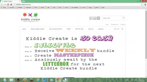
Erin and her partner have been running Kiddie Create for two years, but she says that sales haven’t picked up and neither has traffic, and they’re not sure why.
Let me start by saying that this isn’t a bad website already. It’s easy to find your way around, the branding is colourful and bright, it’s fairly easy to see what the product is. So Erin’s query made me put my very serious thinking cap on.
KiddieCreate have a slide show on the landing page; this could be used better, by showing off a variety of things that kids have made, add in some more happy faces and little hands proud of their achievements. Make it sing with their joy! Think about who you are actually appealing to as well (the busy mums, of course!) and so you could include something about what problems your product solves (e.g. how to keep thinking of new stuff to keep kiddos entertained). I would also suggest that on the slide show, all the slides should be crisp – make sure images are big enough so they don’t have to be stretched, pixelated or blurry.
One of the slides mentions Fundraising, and yet I can find no further information about it anywhere. If it’s something you do, let people know what it is, otherwise, get rid of the slide!
I couldn’t find anywhere to subscribe to a newsletter – is there one? A newsletter is an excellent way to keep in touch with previous customers, and/or keep potential customers informed about new products and developments in the business.
Add in some free printables – for instance pictures for colouring, a face mask or simple origami, to encourage more traffic to the site.
I would add more information in the “About” section – I can’t even see your names! Just some excellent photos, which demonstrate you both have children. What are your backgrounds? Do either of you have any professional experience in working with children? More importantly, why and how did you start KiddieCreate?
Tell a great story, and people are much more likely to trust you, like you, visit you and buy from you.
To generate more traffic, you need to think outside just tweaking your website. KiddieCreate are using Facebook well, with frequent postings and engaging photos, as well as Instagram and Pinterest. They could also try a variety of other strategies to get themselves out there, including guest posting on blogs in their niche, and approaching magazines and blogs to feature their products.
Your website is only one part of your overall strategy for publicity about your product. Do some research and discover what else is happening in your niche and the most likely places your customers hang out. Then hang out there with them.
Susan Fowler – About the Place
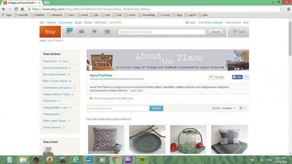
Susan has a fascinating shop full of vintage from many eras, as well as a selection of handmade cushions and other items made from vintage fabrics.
As I’ve noted in previous posts for the MMM series, when you have a shopfront on Etsy, there is a lot of Etsy’s branding which takes up the screen space, and so Susan is limited in what she can do. Having said that, I think she has done OK – her shop banner and backgrounds of the photos are fairly consistent in their use of soft greys, and she has chosen her featured items well so that they fit in with this colour scheme too. The only tiny thing I would suggest is that her shop banner looks a little blurry! – a very minor detail overall.
Her product photography is very good – I really like how she has arranged her items with a few very well chosen props – a flower here, a succulent there – great for adding a splash of colour and/or texture contrast.
I also took a look around the rest of the shop. She has written a good shop ‘About’ page – we get a solid sense of who she is, what she likes and why. Her shop policies are clear and reasonable, and she seems friendly and approachable.
If Susan is concerned about traffic to her shop (which is why she contacted me), like KiddieCreate above, I would suggest that she needs to get outside of Etsy more and find other avenues to communicate with her customers. Susan has a Facebook page, but she doesn’t use it frequently enough to be useful to her business.
Even though we all say we love to hate Facebook, we all still end up there – I know I do!! It’s a great way to connect with customers when you use it well.
The way Facebook works is that they have algorithms to sort through the most ‘engaging’ stuff (i.e. the most commented and liked) and put that into people’s feeds. So the more you interact with your customers, the more you get seen. You also are more likely to be seen by those customers that interact with you the most. So, I see posts from Colossal because they’re incredibly popular, and also from Middlemost, because I ‘like’ her posts frequently.
Susan could also do a bit of research and thinking in order to get quite specific about who her ideal customer is, then figure out where they hang out, and go there and meet them. She could find some good blogs in her niche, and then write a blogpost or two on how to look after vintage wares, what her favourite era is and why, or even how to identify various eras. There’s lots to write about vintage!
Sue Flewell-Smith – Ivy Rose Design Studio
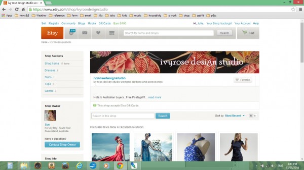
etsy.com/shop/ivyrosedesignstudio
Sue designs and makes a range of dresses, from casual right through to the very glamorous, formal gown end of the spectrum.
She has some beautiful photographs of her more formal dresses being worn by women in the open air, and I love the natural backdrops with open skies. However, there are other photographs with a variety of backgrounds and lighting – outside against a brick wall, on the catwalk in artificial light, indoors, in a studio with a white backdrop, with and without models. The result is a real mix, and doesn’t convey a clear message about who Sue is and what her style is.
My first suggestion to Sue is this.
Be consistent in your photographs, in their lighting and their backdrops – it helps to create a tidy-looking shop. Your photographs are another opportunity to confirm and enhance your branding.
If she has easy access to the country, then take images in rural settings – they look fantastic. If that is not always possible, then in the studio as much as you can, with consistent lighting.
Looking at her garments, I would suggest that Sue’s style is more elegant and formal than casual, and that her branding and shop approach need to reflect this. You can have a very lush and beautiful looking shop, and still sell casual clothing – but in my opinion, it’s a bit harder to do the other way around. Think about what upmarket shops you’re attracted to, and why. Research how they present themselves – colours, backgrounds, fonts… then relate what they do and how they style their clothes to your own shop. Show off your best pieces!
I have also noticed that Sue has several items in blue, and several more in black – I’m not sure if this says something about the colours she is naturally drawn to, but if it does, perhaps she could use these in her branding somehow.
In her shop policies, Sue needs to think more carefully about first impressions – her “welcome” section could be much more welcoming! And it only repeats information that is shown elsewhere. The Welcome section is another great opportunity to say hi to your customer and to let them know who you are and what you’ve got to offer. Imagine you’re the customer and then go through each of your policy sections, and think about how you would react to each one, and rewrite them where necessary.

Thanks to all of today’s participants! I wish you all the very best.
Now it’s over to you fabulous readers again – how did you go?
Can you think how the suggestions I’ve made today could be applied to your biz? What would you change? What would you keep the same?
Have I still not solved your problem for your biz?
If you’ve got a specific question let me know in the comments below.
AND, if you would like a Monday Mini Makeover on your biz, you can join in too – all you have to do is follow the instructions over here.
Catch you next time!
Julie X
Thanks so much Julie. I have started revamping the welcome page and am working on getting more consistent photos and shop policies, all a work in progress lol. Next step the web site!!
oooh, can’t wait to see Sue! Let me know when you’re done, and we might have a re-visit!! Julie X
Thank you so much Julie for the mini makeover review! I have ignored my Facebook page shockingly, through fear of annoying people but I will take your advice and bite the bullet. I don’t know why my banner is blurry as it was made at a high resolution but thanks for pointing that out. It is so lovely of you to take the time to help us all out, I really appreciate it and your kind words.
Hi Susan, I think sometimes with jpg files, some platforms can compress them – I’m not sure that this might have happened with your Etsy header, but perhaps this is the case. You may be better of with a png file, which doesn’t lose quality like jpgs; and load it up at the correct size (760px x 100px), to get the ensure you get the image you’re happy with.
I’m so glad you found this feedback helpful. Don’t worry about being annoying on FB, just be yourself, give snippets of stuff that’s happening around you – link to other articles or images from around the web that you find interesting, as well as what’s happening in your own work. I look forward to seeing more of you on FB 😉