In the last post, I talked about defining your business personality with words. It’s fun, did you have a go? How many words did you come up with? If you’re anything like me, I can find an enormous list of words that fit aspects of what I do. I’m so complicated LOL! (I’m the same with colour – it’s so hard to limit myself to just a few). But with your business, you need to be clear-sighted and cull those words down quite a bit, to get to the essence of who and what you are (6-10 words is great).
To explain how that business personality is expressed visually, I thought it would be useful to look at a few great shopfronts and websites. As I said last post, Business Personality and Business Identity work hand in hand. With the visual stuff we’re getting more into the area of Business Identity here – the colours, fonts, imagery etc that you use in your branding, but the point is that it should be very expressive of your business personality.
THE COLLECTIVE.
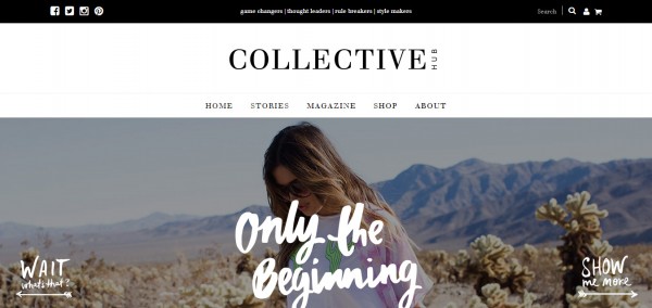
If you’ve been hiding under a rock, The Collective is part magazine and part inspiration for business-minded creatives. It’s the brain-child of Lisa Messenger (and if you’ve never heard her story, you should – it’s a gob-smacker).
The Collective labels itself as “game changers | thought leaders | rule breakers | style makers”. It’s aimed at 35-ish creative folk who are intending to go places, completely on their own terms. It’s glossy, romantic and big. So, it uses lots of stylish, large-format vista-type images, with a bold, hand-painted script font. It’s lots of black and white too, which further emphasises strength. Black and white is uncompromising.
MEET ME AT MIKES
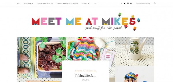
Meet Me At Mikes is a blog about life, crafting, and a whole bunch more, written by Pip Lincoln who is the author of several books on crafting, and writer for a number of other well-known places such as Kidspot and Frankie Magazine. It’s completely colourful, cosy, homey and happy. I love this header! Its collection of bright, clear colours are wonderfully cheery, its shapes are simple and clean. Using a variety of colours in this way conveys inventiveness and a vibrant interest in living, and there is always tons of colour throughout her blog. The scattering of blocks on the end only add to the whole playful effect. Her imagery is filled with retro, cute, and lots of closeups of homespun textures. It’s like she’s inviting you into her home.
THE DARLING TREE
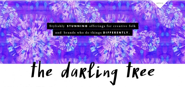
The Darling Tree is an entirely different kettle of fish. Jo Klima founded The Darling Tree as a shopfront for her design services (which she still offers), but has more recently extended into surface design and products printed with her patterns. She has shifted from a quite feminine, gentle style, to one that is more expressive of her spiritual journey, and focuses on a vibrant palette of purples, pinks, and aquas, in a variety of bold, painterly patterns (her site loads a different pattern in the same palette every time you refresh). Like The Collective, Jo chooses a bold, handwritten font to be expressive of individuality and strength. The whole suggests artistic expressiveness, femaleness, strength and daring.
THE PAPER MAMA
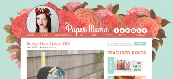
Chelsey Andrews is the force behind The Paper Mama, which focuses on DIY crafts, personal style, and food. As well as her own blog she writes about DIY and craft for companies like HP Create and Better Homes and Gardens.
Her style is definitely very feminine, with tons of flowers. Her colours are warm, rich, with some lovely soft textures in both the aqua background and the handpainted header. They are also not overly bright and a bit muted, giving a sense of the old-fashioned. The handpainted header and the not-quite-straight hand drawn chain circling her photo all evokes that retro homey, DIY attitude, with the big blooms making it full and sensuous and very girly.
*
Now, if you’ve got an Etsy shop or similar, it can be a whole lot harder to convey your sense of brand personality, because so much of the screen space is taken up with Etsy’s set format. While it can be harder, it is not impossible as these shops show inventive ways to use their header space.
POAST
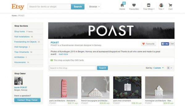
Within Etsy, you’re mostly limited to your shop banner to convey your brand, unless people choose to scroll down. But POAST (who I featured a little while ago here) still manages to create a space that is cool, modern, and very definitely Scandinavian. The Etsy banner space is quite long and not very high, so you need to use an image that uses horizontal space well. Laurie has used a misty image of the mountain forest to great effect, choosing one that has virtually no colour to complement her mostly white ceramic style. The shop name is in a clean and modern san serif font with the horizontal removed from the A, making it both distinctive and classic at the same time. It is also smack bang in the centre, giving a sense of balance and maturity.
THEATERCLOUDS
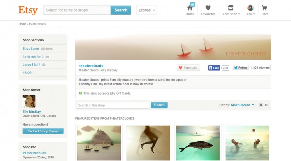
Many people choose to use an image of some of their work for their header, and if it’s done with care, this can be a great idea as it can instantly capture your mood and colours. Theater Clouds (who I wrote about here) has evoked the whimsy and serenity of her work with an image of tiny sailboats. The image is beautifully lit (as is all her work), has a lovely horizontal flow to it, and is warm and inviting with the use of soft red in the boats and text.
WIRED BY BUD
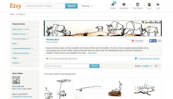
A bit more “blokey” by the very nature of using hulking buffalo as his subject matter, Wired By Bud has created a scene specifically for use as a header. It’s kind of humorous and fun, and shows off what he can do. His shop name is in a strong, classic font that contrasts well with the wire shapes. The only thing I would tweak is the quality of his banner image, as I find it fuzzy and grainy and that’s distracting.
I know Etsy does compress images so you might not get it perfect, but if you are having any similar problems, try uploading your images as the highest quality .jpeg, or even a .png file.
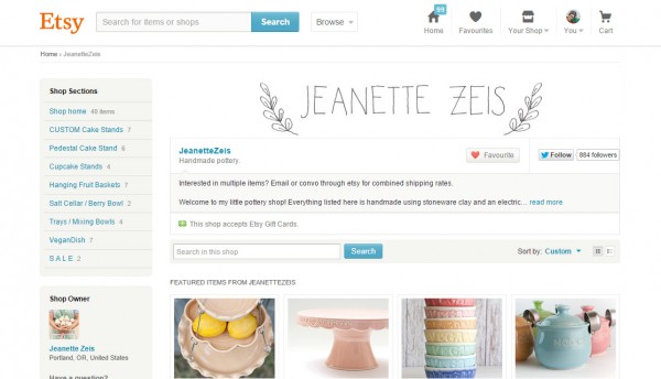
JEANETTE ZEIS
Of course, you don’t have to incorporate any of your work into your banner, or even any images. Ceramicist Jeanette Zeis relies on an extremely simple, hand drawn banner of her name. Why this works is that it strongly echoes her ceramic style – there is evidence of the hand-made in its uneven lines and edges, it is soft yet strong, with a touch of the classic in the wreath of leaves, reminiscent of ancient Greek crowns. Overall it looks open and gentle, and doesn’t take itself too seriously.
*
Got any questions about ANYTHING in this post? If you do, pop your questions in the comments below. Do it! You never know who else might be wondering exactly the same thing but be too shy to ask.
Let’s help each other!
Julie x
(p.s. I’m just about to launch into Brand Coaching for you! With Questionnaires, Skype sessions and a whole heap more. If you’d like to be in on the ground floor AND get a substantial discount on this service, get on the mailing list below!)
