Welcome to the next instalment in my series on Design How-To. (You can find the rest of the series here.) I trust you’ve been enjoying it so far! And I really hope it’s been helpful. This post is on the ever wonderful Colour. (And yes, this one’s a little longer and more involved than other posts so far – but please stay with me! There’s HEAPS to know.)
I know there are quite a few sites out there dedicated to colour alone, and that really is no wonder. It is often the first thing we notice about something, apart from the overall form of the object; it is an important part of our initial impression.
The importance of Colour is also attested to by the plethora of books written about it; it is most definitely a whole area of study on its own. And although I obviously have no claim as any kind of trailblazer, I would like to gather a few thoughts together here, in the hope that it might confirm or extend your ideas on how to work (and play) with colour. I hope it might even encourage you to experiment and surprise yourself! So here goes…
Colour is sometimes referred to as hue. There are three primary colours (red, yellow, blue), which can be mixed to form secondary colours (orange, green, purple), and tertiaries (those colours in between the primary and secondary colours). Colours can be darkened with black (tone) or lightened with white (tint), and muted with various shades of grey (value, or saturation). There are infinite variations that can be achieved.
And although I do agree that there are some hues that I love more than others (um, I could be a little obsessed with aqua), I do not have a colour I hate – each colour is perfect and wonderful when used in the right situation (cue ‘bottle green’ and ‘mission brown’ – so often misused and abused, hence the collective hate).
Colour, and colour combinations can be clear, muted, loud, subtle, pale, strong, murky, and more. They can be utilised to enhance the ‘mood’ of a piece – cheerful, romantic, bold, fresh, and many others besides.
Johannes Itten, painter and educator at the Bauhaus, developed the Colour Wheel (or Sphere) in the early 20th Century from earlier colour theories, and now his Wheel has become a standard reference tool around the world. His book The Art Of Color, first published in 1960, is still a pillar of reference.
When choosing colours to coordinate, use the colour wheel as a guide; here are some basic ideas.
- Two colours that are directly opposite each other on the colour wheel look good together, and are referred to as complementary, e.g. yellow and violet.
- Three colours that are equally spaced from each other on the wheel, forming an equilateral triangle, also look good, e.g. blue-violet, yellow-green, and red-orange.
- Two or three colours right next to each other on the wheel are called harmonious, and look good, e.g. violet, blue-violet, blue.
Another idea to consider is the value of the colour – dusky pink will most often look terrible with a clear bright red, even though they have a similar base hue.
When using colours, consider the fact that coloured light reflected from one object/area can alter the colour of another object/area. You can probably understand this best by thinking about what colour the walls in your house are painted, and how they look different from one room to the next, depending on where windows and furniture are. This concept can also be useful to remember when you are making much smaller things!
Because it is part of our primary impression, colour can really enhance the ‘mood’ of a piece. Saturated (pure, rich) colours generally make us feel more positive than dull or subdued colours. But each hue has it own associations too – yellow is a bright happy colour, often associated with sunshine; alternatively, dull yellows (mixed with greys) can sometimes look a bit sickly. Red is the colour of blood, and so often is associated with danger and passion. Pink, being a softer version of red, can be associated with the feminine. Blue is a cool colour, associated with water and the sky. Light blue suggests tranquility, and dark blue suggests stability.
Still with me? Excellent!
Let’s look at a few examples of works that have used colour well.
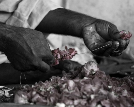
This gorgeously delicate image uses a very simple technique of enhancing one area with subtle pink to denote the beauty of what this worker is doing – threading blossoms onto string for garlands. We are always drawn to an area of colour if the rest of the item/image is neutral.
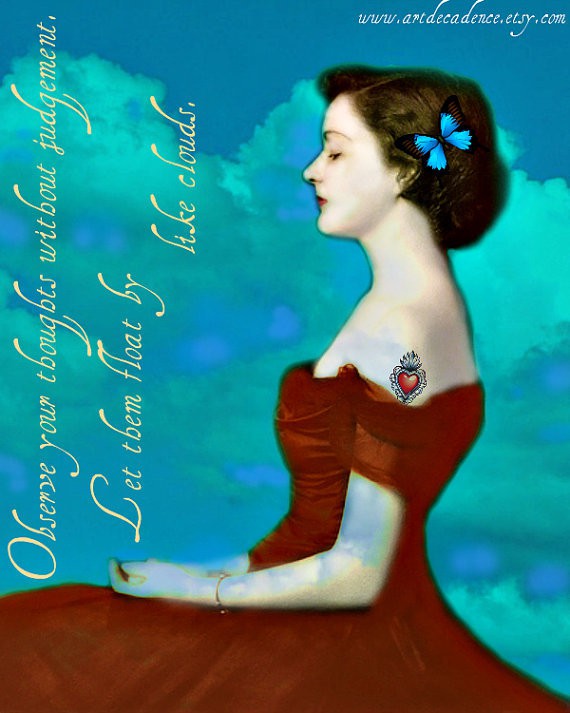
In contrast, this image has great saturated colour. However, its intensity is balanced by the pale skin, and the tranquil pose of the subject. Note also that the turquoise and deep orange-red colours are close to opposites on the colour wheel, which is why they look so good together. (And a note: Despite not being exact opposites, the turquoise and red still work because of their saturation – both colours are intense and rich)
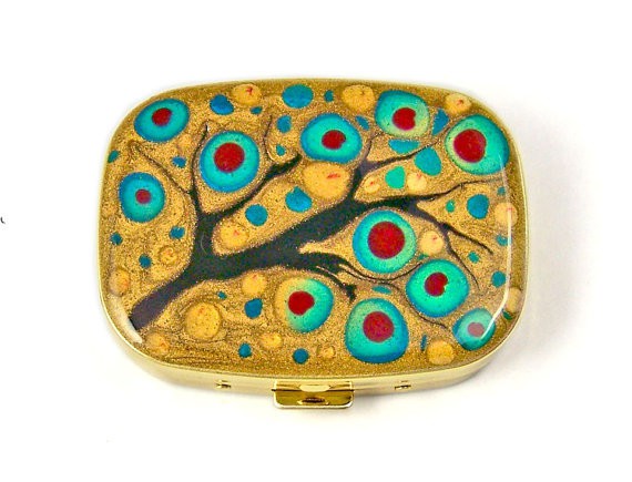
This cute little pillbox also uses turquoise and red (less orange than previously), but adds in gold. These three colours form close to an equilateral triangle on the colour wheel, and the small shifts in hue within the turquoise areas provide extra richness. I am also quite taken by the metallic sheen of the gold next to those rich hues.
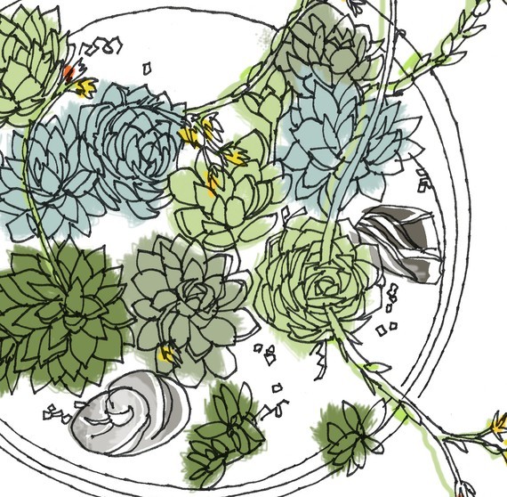
A collection of hues that sit next to each other on the colour wheel look great together too. The greens and blue-greens in this print are not pure colour, but have been mixed with grey to dull the colour, conveying a much more gentle mood. The tiny spots of pure yellow and orange-red provide subtle yet vibrant points of interest.
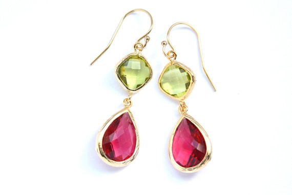
The liquid translucence of the gems in these earrings gives great depth to their colour, which is enhanced by the warmth of the gold setting to create a rich and glamorous look. Think about how the ‘mood’ of their appearance would change the look if the green stones were a milky green, or if the setting were silver.
I adore this surface design – the choice of colours is great, but what I love is how the outlines use brighter, contrasting hues (especially the red scales with light turquoise lines) – so much more intriguing as it is unexpected. We have come to expect that outlines in drawings are darker, often defining areas of shadow, so to use colour in this way creates a wonderful surprise.
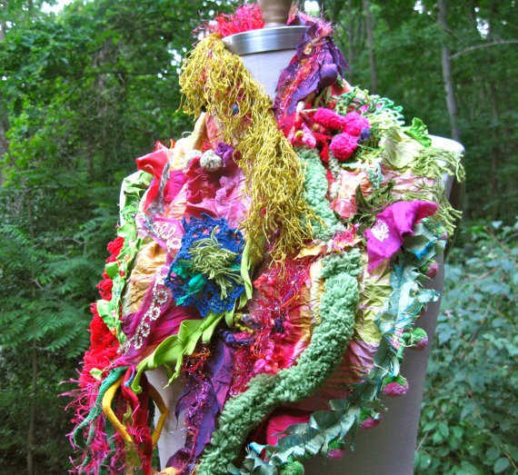
Here’s a fabulously wild piece to finish. It might look like a bit of a mish mash of whatever the artist found that day in her studio, but somehow the piece manages to work! How? If you take a more considered look, you will see that there are multiple areas of magenta and red hues throughout to visually tie the piece together. Likewise, there are also multiple areas of green. Note also that all the hues used are fairly vibrant, pure colour; not too much that has been toned down with greys. And the structure of the scarf is another element that helps to bring cohesiveness to this – we can follow the strong lines of of fluffy green from the neck to the bottom of the piece. Certainly not a wearable for the faint-hearted, and certainly not something for a beginner to attempt, but you cannot deny that impact!
*
As I mentioned at the beginning of this post, there is a huge amount more to be said about Colour and how to utilise it to enhance your work, but I hope these few brief examples have got you thinking just that little bit more about how to apply it to your own work.
The last thing to remember is that these ideas are guides, not hard and fast rules! But it IS vital that you understand the fundamentals before you start trying to dazzle the world with your amazingly wild colour combinations. There is SO much to learn about colour, and how it works, so ‘Steady as she goes’, I say!
*
If you’ve got a project that you’re proud of, that uses any of these Elements and Principles, I would LOVE to hear about it! If you’ve got a pic of it up online somewhere, please add a link in the comments below, so you can show it off!! 🙂
(and add a little comment about how you’ve used the Element/Principle/s?)
Well hey, you know what? I think we’ve covered all the Elements of Design, so in the next How-To we will be starting on the Principles! Just as a refresher in case you’re wondering, you can think of the ELEMENTS as a series of tools you can use, and the PRINCIPLES as the methods you can apply in using them. And there are always crossovers between these ideas; each element or principle rarely works in isolation.
So next? Perhaps Repetition – or the other side of the coin, Contrast… What do you think? Seeya soon!
Julie x


Julie, that’s a great article on color!!!!
What I’m doing very intuitive with color, you described very professionally.
Thank you!
What a wonderful, informative post!!! Wow, love how you’ve described the processes including our own. What a gift!
A great post Julie. Wonderfully written with an abundance of information. Thank you for including my work.
What a wonderful article on colour! I’m so pleased that you included the ‘Like Clouds’ print. I’ll put a link to your post on my facebook page so that others can enjoy your insights as well….
This is a great insight into the use of color! Thank you so much Julie for including my earrings.
I’m flattered, I have always loved your ‘eye’ for design and color!
Cheers! Kerri
A great overview Julie!
I agree with you about not hating any particular colour though I do have to admit to grumbling loudly when ever I’ve had to work with orange. 😉