(photo credit: Uzair Nazeer)
Build your atmosphere
“Strike a pose” said Madonna. She did, and she mesmerised millions.
That’s what you need to do to build your brand – you need to project a distinctive idea. You’ve got to put something particular out there – anything less than distinctive is … well, ordinary. Boring. And there’s a squillion “ordinary”s out there, and you’ll disappear into a sea of nothingness.
But as cool and sexy as Madonna’s pose is, branding is not about one moment of glamour, it’s not a single, elegant flex of the body (or mind), it’s not a short burst of doing your thang on the dance floor (although it can totally incorporate those moments, and should).
What branding is, is a complete and consistent story built around those moments; but it’s something more than those moments besides. Your brand is a mood, a vibe; your brand is like a world enveloped in an atmosphere that you’ve created.
Just like in real life friendships, people are attracted to you because of your approach to life; your personality. Because you’re consistently YOU, and no one else (think: how did people react when you last did something completely out of character?). Same is true of branding – consistency is paramount. And branding exists at every touchpoint you have with your audience – the visuals, the words you use, how you treat your customers. Consistently using the same colours, the same fonts, the same imagery style (and using the same kind of language when you talk about what you do) = the same feeling.
A blank canvas is death
What happens if you aren’t consistent? If you don’t set yourself parameters? Well, I learnt in art school a long time ago that a blank canvas will result in one of two things:
(a) You’ll play it small and safe and conservative, stick to what you know, and end up with something that just looks same-same.
(How your audience perceives this: { …yawn… next please} )
(b) You’ll end up with some kind of random, unstructured, disorganised mess (although this might give you the spark of an idea for something else and that’s great, it’s extremely rare that this approach will result in a useful, finished piece on its own).
(How your audience perceives this: { …ewww… next please} )
When you DO have parameters, it makes those creative juices start sparking up, you become more inventive, you start to think of ways you can push the boundaries, all the while staying within your boundaries.
(How your audience perceives this: { …oooh… stylish! hmmm… interesting… } )
So, get yourself a guide and a game plan.
Your Brand Style Guide
A Brand Style Guide is a very useful document that simply lays out all the elements you’ve chosen, so that you can refer to it any time you need to (print it out and stick it up next to your computer for easy reference). With your own style guide, you’ve always got a starting point if ever you need to make a new graphic for anything (blog post, ads for social media, newsletters, business cards, flyers, whatever…) all of which saves you a LOT of time.
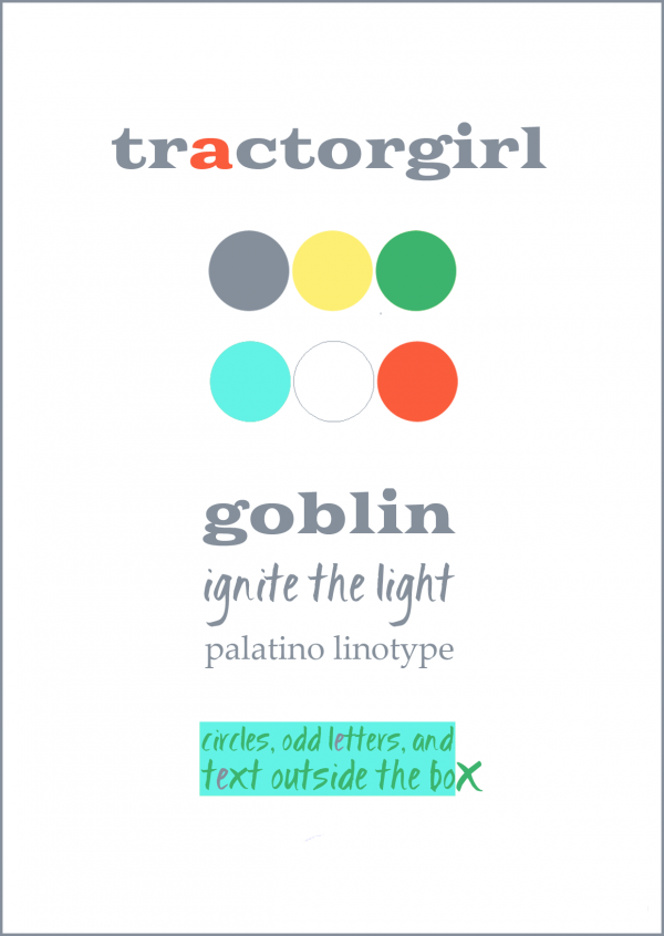
Here’s a simplified one for tractorgirl. It includes my palette, the fonts I’ve chosen, and a bit about how I treat the typography in layouts.

When you get to making your own, there’s lots of other things you might like to include in a style guide too; whatever suits your business. Here are some suggestions –
- Your brand name
- Your brand description/personality in words
- Your logo and tagline if you have one
- Brand colours (include a colour swatch and the hex code for each colour)
- Brand fonts – writing the name of the font in that font is often easiest (include different weights, italics etc if you like)
- Styling notes on product photography if you’re selling physical items
- Notes on style and mood for any other imagery you use
- Examples of any fancy elements you’re using – borders, background imagery or patterns etc.
- Any other notes on when and where to use particular elements.
And get ready to dance – show off what you can do.
*
(Update: You can find all 5 of my best tips for branding here)
Julie x
