There’s decoration and there’s decoration, and seriously, it’s not just a matter of taste. What do I mean? I mean the thoughtless sticking on of stuff, just because “it’s-popular-therefore-it-must-be-good” or even “it needed something, so I stuck a flower/bow/octopus on it”.
")
However, I will forgive Nick Cave (the performance artist with the wild costumes [above], not the singer/songwriter, whom I also admire deeply). His work lives because of its excess – overload on overload. It’s a wild conglomeration and dazzling to the eye, but what makes it work is all the elements that correspond. See how much yellow and red he uses throughout, and check those fabulous protuberances – they’re recognisable as a bunch of tin toy spinning tops.
")
And lots of flowers. And all so fabulously tactile.

Design has to be meaningful and appropriate to be good; therefore a decoration needs to be considered properly and be a necessary part of the thing that it’s decorating. That means if you took the decoration away, the thing would seem poorer for it, or less powerful in some way. I’d reckon that’s certainly true of Nick’s work. What would it be without excess?
However, not everyone is good at excess.
Fair enough; that kind of thing takes guts and vision to pull off.
But many folk aren’t good at restraint either. I see so many instances where the decoration is unhelpful at best, and an appalling abomination at worst. Having a trawl through Etsy brings up some rippers.
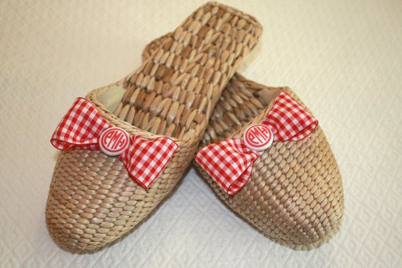
monogrammed straw slippers – goodsportdesigns.etsy.com
I cannot bring myself to publicly share some of the totally dreadful things I’ve found. So I’ve chosen these because they’re more or less well-executed (despite the fact that the slippers above are actually imported from China, and the shopowner is simply handy with a hot glue gun). The design problem here is that there is little in terms of visual elements that relates the fabric and/or button to the slipper. Perhaps the scale of the gingham is kind of close-ish to the scale of the weave, but that’s drawing a pretty weak link, and that’s about it. There is no correspondence of shapes, colour, texture, or anything much else that I can see.
Take away the bow, and you’ve got a beautiful texture, with very lovely natural variations in the colour of the straw. I think that’s interesting enough on its own.
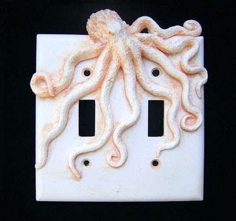
octopus light switch cover – sookesculptures.etsy.com
How do you fancy fumbling for the light switch in the night and encountering an octopus? This switch cover appears to be cast all from the same material, so it’s the same colour… but how is this in any way enhancing the shape (or even usefulness) of the switch plate? I’m absolutely positive there are an infinite number of other things I could put on my walls to add interest to my room.
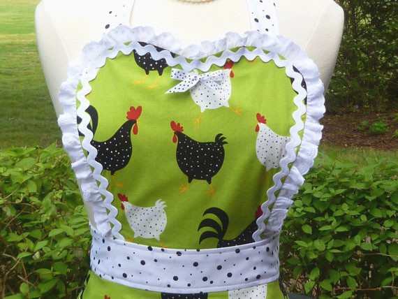
sweetheart apron – CarlaGAccessories.etsy.com
A girly chooky apron. OK, I’ll pay the spots, even if they’re not my cup of tea. But ricrac AND broderie anglaise ruffles AND a bow?
Please, please, please, think carefully about adding in stuff just because it’s there. For design to work well, it needs to correspond well with the object it is gracing. It also needs to add something, more than just itself. It needs to add a deeper element of beauty, of interest and/or of meaning.
In the words of the legendary architect Mies Van der Rohe, “Less is more”.
Unless you’re Nick Cave.
*
What do you think? Do you like the examples I’ve given, or do you disagree with me entirely? I would LOVE you to tell me your thoughts!
Julie X