OK. So here we are at the very last post in my series – Design How-to. It’s been a blast finding lots of totally fabulous stuff to share with you and illustrate each Element and Principle (although it’s meant an awful lot of time trawling through Etsy/Pinterest ;P). And thanks a heap for all your feedback!
So today’s post is the cautionary sting at the end of the fairy tale – and it’s pretty simple really. It boils down to this : interest is created in a piece when Elements and/or Principles are emphasised. However, don’t try and combine too many in one piece of work, because it can result in a visual mess, or at the very least, a piece that just doesn’t gel. Keep it simple by emphasising one or two Elements/Principles to achieve a unified result.
This hat may have possibilities, but for me the only thing that visually ties the rose to the hat is its texture. I like the soft colours in the hat, and perhaps if the rose and leaf were in pastel shades it wouldn’t look quite so ‘stuck on’. The blanket stitch is also a bit chunky for such a delicate material as cashmere. Some possible solutions might be to more closely match the thread colour to the applique pieces, or, as the knitted fabric doesn’t need edge-finishing, it could be attached using a more delicate stitch such as little seed stitches or french knots.
This very lovely dress is constructed from many different fabrics. They are all of a similar weight, so the whole would move and flow together when worn. With its overall muted palette, it has emphasised strong horizontal and vertical lines to give the design structure, and has repeated the delicate blue chiffon at the hem and the neck.
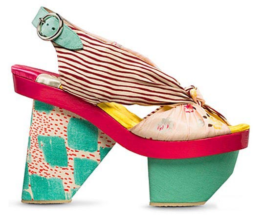
Now, I don’t usually feature pieces from big fashion houses, but this wild and crazy shoe by Kenzo caught my eye. It seems to do just about everything wrong – stripes, florals, abstract and flat colour – but it still works! If you investigate a bit more more closely, it is the subtle touches that do it. The turquoise green is repeated in the heel buckle and the base; the scale of spots, stripes and flowers is small and delicate, and the bright colours all have a similar intensity of hue (chroma) about them.
Trying to design like Kenzo means you have to understand the rules REALLY REALLY WELL, so you can bend them to your own will. Don’t try this at home, kiddies! It’s definitely for the experts.
*
So that’s it! Like all things in life, the more you practice, the better you get. Start with the basics, keep doing, keep experimenting. There’s a whole world to pick and choose from out there – keep your eyes open, choose what you like, develop your own style. If you keep going, you’ll get somewhere. Believe me, you will.
Julie x
***
If you’d like to have all of these posts in an easy-to handle, revised and updated e-book format, you can! Sign up for the tractorgirl newsletter, and you receive the e-book free.
My newsletter is full of design tips and crafting how-to gained through my many years’ experience as both practising artist and educator {more about me here}.

design elements & principles – e-book
Jump on board! Just enter your email into the box below, and hit GO.
*


Very interessting article. I like your presented clothes.