Welcome to the next in my series on Design How-to – this one’s on the Principle of Harmony. (And just in case you need a quick refresher, you can think of the Elements as a set of tools, and the Principles as various ways you can use them.)
Harmony in music is a lot like harmony in design – it’s how the parts of an artwork look like they belong together in the same piece. They co-ordinate through their similarities (and sometimes contrasts), and this can be achieved through the use of similar shapes or colours, or any of the other Elements – tone, line, texture, and/or direction.
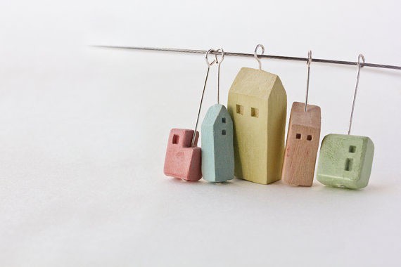
This sweet collection of little houses harmonise in pastel tones. A soft, smooth texture is created with the base material of clay. Their lines and overall shapes are simple, with size, shape and placement of the windows also similar in each – the windows are small and placed towards the edges of the house-forms. However, sameness and boredom is avoided, because interest is created through gentle variety of shape and colour, and a soft flow of size with the biggest house in the middle.
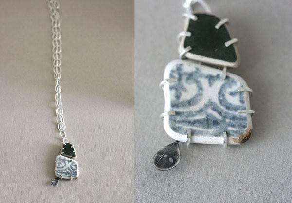
Despite the varying shapes and sizes, the individual elements in this pendant harmonise for several reasons. The ceramics and silver exist within a very narrow colour range, which give unity through monochrome (i.e. when the hues are the same or very similar, and the tone varies). The pieces also work together because of their organic, uneven-ness of shape, and because of their soft textures. The simple claw setting and the raw clay edge sit nicely with the un-shiny, oxidised (blackened) silver leaf shape that pokes out the bottom. The simple claws also harmonise well with the open and spacious look of the handmade chain.
What I find intriguing about this piece is that lovely fragment of pattern between the two smaller and darker areas – what is its story and how did it arrive into this pendant? Definitely a piece for pondering.
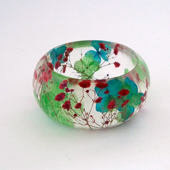
Contrast of shapes and colours are a dominant factor in this wonderful bangle that uses real flowers, cast into resin. To tie the whole thing together, the artist uses the soft shapes and colours of the blues and greens for harmony throughout the bangle. The red flowers strike a chord with the blues and greens, much like in music when there are soft base notes, with a brighter melody on top. The overall shape of the bangle is kept simple so as not to distract from the flowers. Imagine wearing a little bit of garden on your wrist – endlessly beautiful.
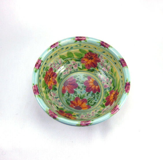
This fabulous bowl is full of pattern; it is profusion bordering on the edge of chaos. But it still works! Harmony comes through the use of lines (stripes / borders at the bottom and top of the bowl), which emphasise bowl shape and structure. Harmony is also created by the distribution of the larger red flowers evenly throughout the body of the bowl, and the regular placement of smaller crimson ones around the rim. I love this bowl, so full of rich and happy colour.
*
How are you liking this journey through the Elements & Principles of Design? It’s been heaps of fun choosing examples to show you, and I’m so glad you’ve stuck with me so far! (If you’re a latecomer, and/or you just want to find out more about this Design How-To series and its starting points, you can find the rest of the posts here.)
As always, if you’ve got a project that you’re proud of, that you can demonstrate any of these Elements and Principles with, I would LOVE to hear about it. If you’ve got a pic of it up online somewhere, please add a link in the comments below, so you can show it off!! ![]()
Cheers, Julie xx


