Welcome to the next instalment in my series on Design How-To. (You can find the rest of the series here.) I trust you’ve been enjoying it so far! And I really hope it’s been helpful. This post is on Direction.
Lines can lead your eye in a particular direction, as can shapes (for instance, an arrow). Lines and shapes often work within an image or design to create Direction. And Direction can be used to great effect to enhance the mood of a piece.
Simple horizontal lines always suggest a feelings of calmness and serenity, while vertical lines suggest active alertness. We can connect it to our perceptions of sleep (horizontal) and awake (standing).
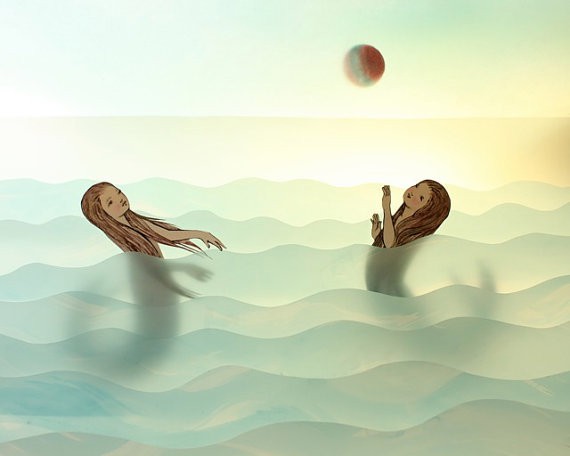
Soft, low waves also suggest calm, but are a little more active. This is a very gentle image, enhanced by the soft, luminous light and clear colours with hints of aqua and pale gold.
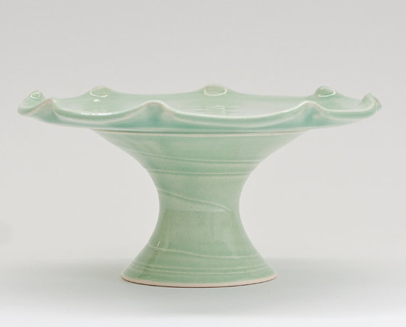
When you look around the rim of this sweet cupcake stand, do you notice your eyes pause at the peaks? It has an interrupted flow – although it is still gentle, it feels even more active than the waves in the previous image.
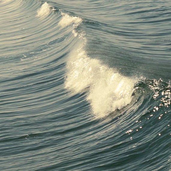
raceytay – venice, california – photography
These waves are not turbulent, but despite their relative order, we can still feel the enormous pull of that water as it sucks to the peak. Strong diagonals are responsible for this effect – the peak of the wave, as well as the stripy ripples of the water. Diagonals always convey a sense of strong activity (and if you want chaotic activity, use lots of diagonals at different angles).
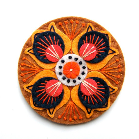
Lines that radiate out from a centre remind us of all the goodness that comes from similarly radiating things; especially the sun, and flowers. Its symmetry is also very pleasing. It tends to suggest centred-ness, happiness, and general well-being.
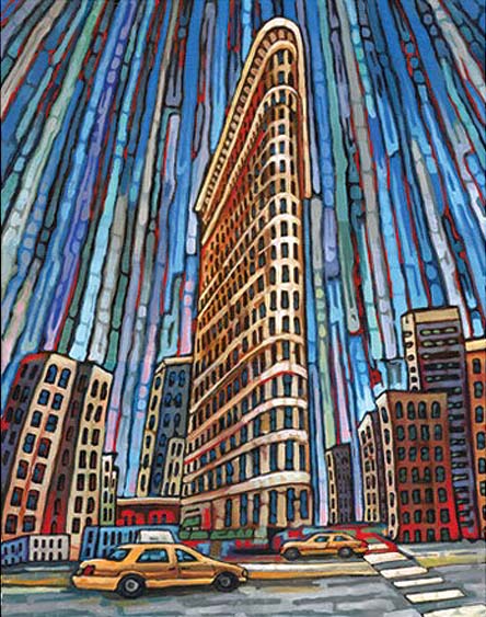
The Flatiron Building in Manhattan is already famously imposing, but the lines converging beyond the top of this painting enhance that idea, suggesting immense and magnificent height. The idea of strong verticals that are so tall they appear to converge is also utilised to great effect in grand cathedrals to ensure the patrons on the ground remain humble to the magnificence of God.
*
As always, there’s heaps more to say about this Principle, but I hope you’ve enjoyed this introduction to Direction in my series on Design Elements and Principles, and I hope it’s given you some inspiration!
If you’ve got a project that you’re proud of, that uses any of these Elements and Principles, I would LOVE to hear about it! If you’ve got a pic of it up online somewhere, please add a link in the comments below, so you can show it off!! 🙂
(and add a little comment about how you’ve used the Element/Principle/s?)
Yay!
The NEXT Element in this series is the ever-fabulous COLOUR!! So stay tuned.

Very informative, interesting and easy to understand. Great post Julie:)
thanks so much J-A! I’m thoroughly enjoying writing this series and finding great examples to demonstrate points