Welcome to the next instalment in my Design How-To series – this one’s on Contrast. Enjoy.
*
Contrast is a fabulous tool for adding interest. Us humans tend to expect regularity in the world around us, because that is how we can make sense of things so we can deal with them. So when we come across something unexpected, that point of difference can be a surprise to our minds; we find it curious, and worthy of more attention.
Contrast can be subtle or bold, and can be applied to any of the Elements – Line, Size, Direction, Shape, Texture, Value, or Colour.
Please don’t think that whacking just ‘anything’ in there is sufficient to create Contrast – you must understand exactly what it is that you are contrasting. Usually, some point of similarity is what makes the work look cohesive.
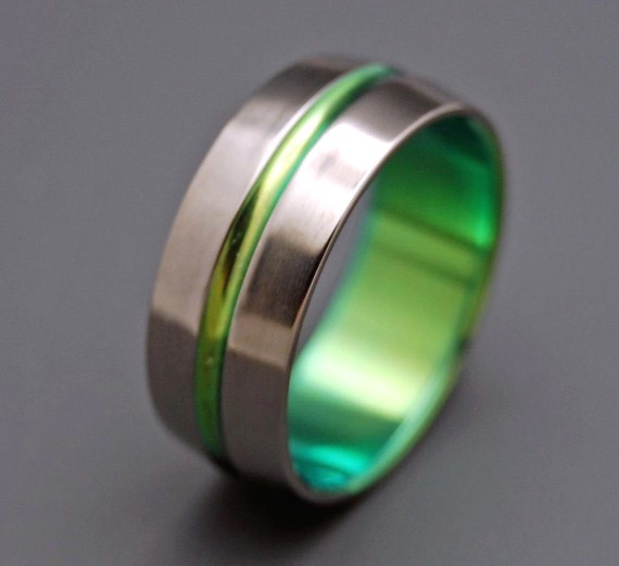
minterandrichterdes – ‘inspired by green’ – ring; titanium
{all images are linked to their respective sources}
In this sleek ring, contrast is used not only in the colour, but also in the form of the narrow raised ridge against the flat wide ring band. Still, they are both shiny and metallic.
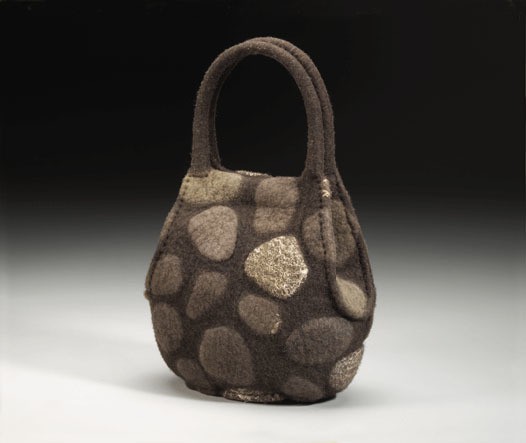
Again, colour is the major form of contrast here, but note also that each of the ‘stones’ is raised from the surface of the bag, to provide extra interest. There are also subtle differences in the colours and textures of the rocks. The concept underpinning this bag adds interest too, because of its surprising reference to the surface of rock walls (she has others that make reference to brick walls in a similar way – you should check them out!). Cohesiveness is achieved through the use of the same material (wool) throughout, the monochromatic colour scheme (same hue, varying tones), and the use of repetition – similar size and shape ‘rocks’.
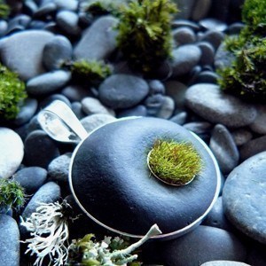
I so love this pendant! Its gorgeously tactile dot of artificial moss looks fabulous against the stone, in wonderful contrasts of texture and colour. Note also, these areas have been neatly contained with silver bezels, which adds a nice definition to the shapes.
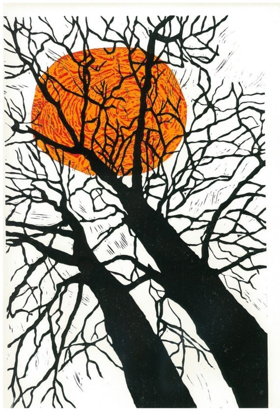
Contrast can be quite singular, as demonstrated in this print. There is only one element of contrast – the sun – and yet it provides the overriding identity of this piece. I love how the sun looks like the boiling mass of flame that it is, with the wonderfully rough textures of red against orange. Great contrast of shapes, textures, and colour in this beautiful linocut.
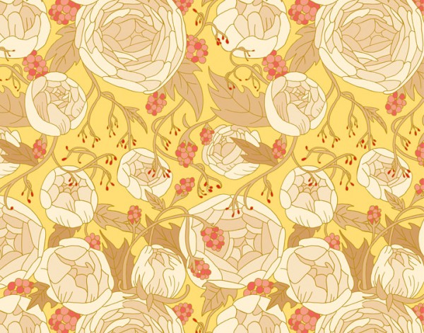
It is the subtle use of contrasts that is so appealing in this surface design. Lots of large, pale, blowsy blooms are overlaid with delicate, fine sprays of dark red buds in a horizontal band. The softer coral colours in the berries throughout tie the design together.
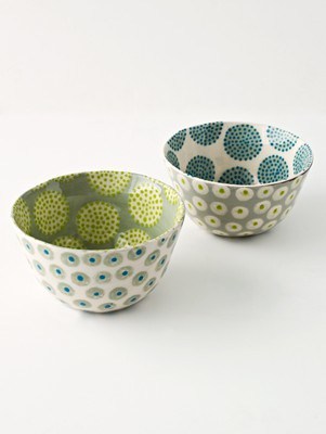
Contrast upon contrast – these totally gorgeous little bowls use a simple, small circle/dot pattern on the outside and contrast it with a larger, more dramatic circle/dot pattern on the inside. Oh yes, I’m a sucker for pattern on pattern! Plus more pattern. Bring it on. 😉
*
I hope you enjoyed this post on Contrast! You can find more about other Elements and Principles in the series of ‘Design How-To’ here.
AND if you’ve got a project that you’re proud of, that uses any of these Elements and Principles, I would LOVE to hear about it! If you’ve got a pic of it up online somewhere, please add a link in the comments below, so you can show it off!!
Julie x
Great examples Julie.
I have to confess I am often guilty of only thinking of colour contrast so this is a lovely reminder of the other forms!