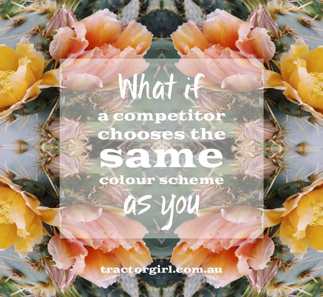
What happens if your competitors choose the same colour scheme as you?
Yes, your brand colours are a key identifier. Us humans are very visual creatures and it’s one very important aspect of your initial brand impression when your audience first comes across you.
However, it’s only one aspect of your brand.
There are a zillion other ways you can connect with your audience visually, as well as talk to them. Which means the ways you can differentiate your brand are almost endless.
How we perceive colour depends a lot on how much of each colour in a palette you emphasise. I can have exactly the same palette as another brand, and if I emphasise my persimmon orange, my brand will feel very different to someone who emphasises the aqua.
One colour is affected by the other colours that are next to it and can be perceived quite differently (this is why interior decorators suggest you take home a sample pot of paint and try it on your walls in your home).
Another thing that affects your visuals even if you choose the same brand colours, is your choice of images. The pink and green in a casually gathered bunch of field flowers can feel very different
So, the best piece of advice here is to go back to your keywords. USE THEM AS A FILTER – FOR EVERYTHING. They’re your guide to how you want your brand to feel. When you’re choosing your stock photos for your social media ads and for your blog post headers, your sales pages and more – make sure that you have your brand keywords uppermost in your mind and filter all your images through them. (When you’re writing articles for your blog or other content, the rule is the same – read what you’ve written and
It’s about being you and having a very, very clear idea of what you want to project.
So don’t worry about if your competitors have the same colours as you. There are lots of brands who use red and yellow for instance – McDonald’s, Hungry Jacks, Vegemite, Pizza Hut, and Superman. McDonald’s and Hungry Jacks are direct competitors. It doesn’t bother them.
Just choose the colours that suit your business, that suit your brand and then get on with creating the rest of it with all those other zillion things that make up a memorable brand. Keywords, image style – but beyond that – your fonts, it’s how you speak, it’s how you put things together, your graphics style. Overall, how you communicate.
So, the next time you discover a competitor’s used the same colour scheme as you, just