Business card design tips:
Your business card is a bit like a PR manager – they can do a fabulous job of introducing you and making you memorable…. or not. {Did you catch Part 1 of “Designing a knock-out business card? It takes a journey through how to choose colours, fonts, images, textures and more so you can figure out how to best convey your business’s style. You can find Part 1 here.}
Today’s post covers the practical aspects – graphic design basics, and the technical stuff you need to know to get the result you’re after. But first up, here’s a bunch more inspiration to get your creative juices flowing (again,they’re all standard size business cards to prove that you’re really only limited by your imagination).
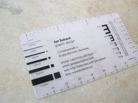
make your card useful like this one from jan sabich
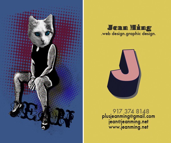
show off your skills like this collage-style from jean ming (front & back)
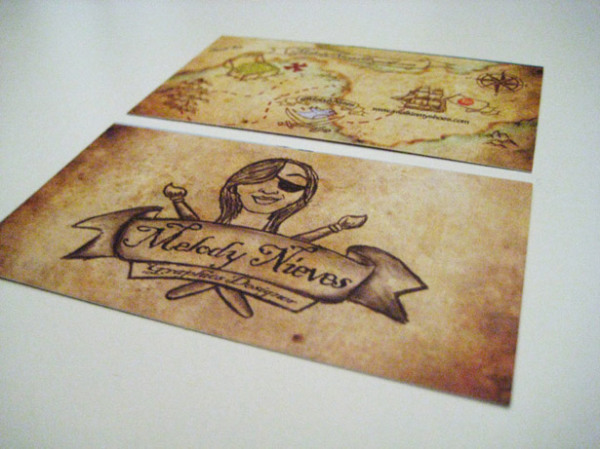
make it fun – pirate-style treasure map from Melody Nieves
add some whimsy and mystery with a bit of scratchie-style
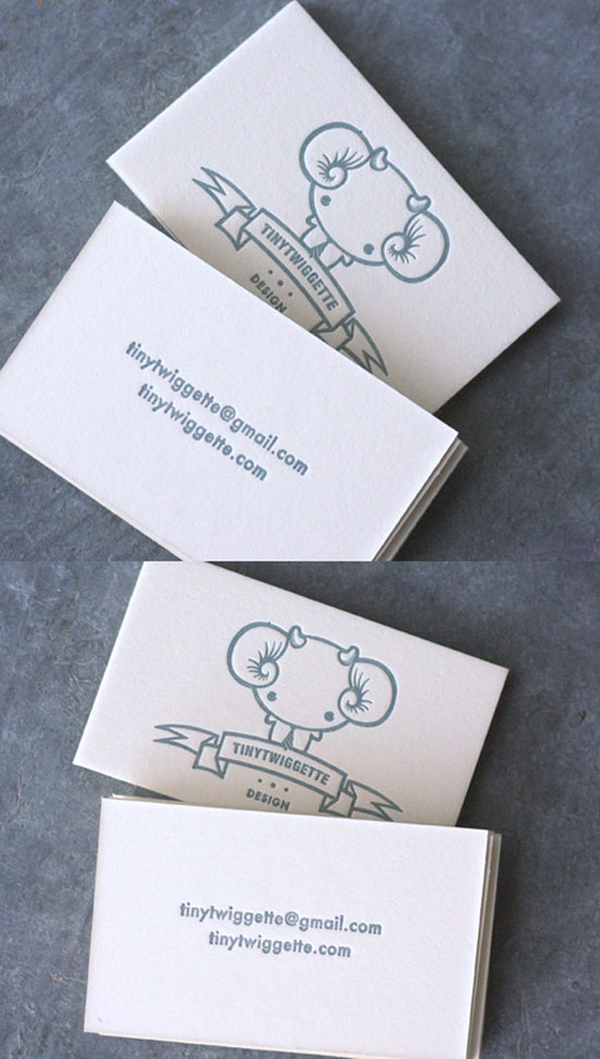
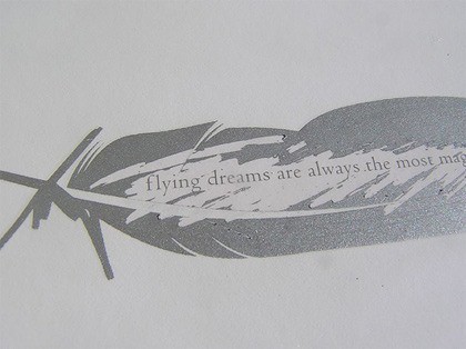
tiny twiggette – gorgeous in letterpress
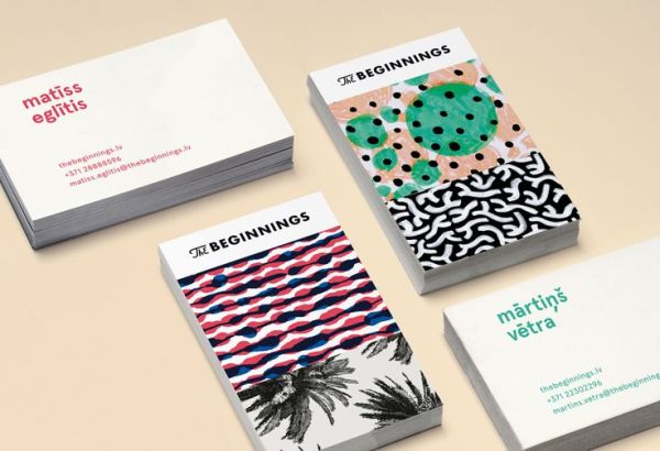
show off your surface design portfolio – the beginnings
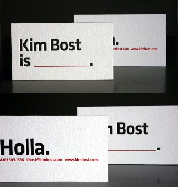
involve your customers – fill in the blank for kim bost
Size
As I mentioned in the last post, the standard size for a business card is around 55mm x 85mm (2″ x 3.5″). These vary a bit from printer to printer, so always check.
Other sizes or shapes can be very attractive and certainly make your card stand out, but they’re usually much more expensive, AND if it won’t fit into a wallet or business cardholder, it’s probably less likely to be kept in a usable spot by your potential customer.
Printers
Now, of course you can make your own business cards, especially if you’re involved in the handmade industry. However, if you’re not careful these can very much end up looking home-made and cheap. So unless you’re feeling particularly confident about your abilities, I would avoid them.
There are two other ways to go – if you’re not confident about making the images yourself, you can take your ideas along to your local printer (who usually have in-house designers to put your design ideas into a finished printable format), or you can use one of the many online printing venues (such as MOO, Saltprint, tinyprints, JukeBox, GotPrint, or google one in your area) who will let you upload your own designs and they print them for you. Most of these also provide you with a downloadable template that you can use in your favourite image editing software,and they will also give you some tips on what to do and what not to do.
When you’re designing your own images to upload you need to also include a small amount (about 3mm) around the outside for bleed. These also vary from printer to printer, so do check.
Letterpress
Letterpress has a wonderful texture as the process results in embossed card which adds a high-end handmade feel. They’re most often handprinted by small workshops, and are therefore much more expensive, and you are also limited to one or two colours. However, good letterpress looks absolutely fabulous and is definitely worth the money if you can afford it.
Digital Printing
When you’re printing from digital files, you need to work at around 300dpi (dots/pixels per inch = about 72 pixels per cm) or higher to ensure a crisp image. So, if you’re designing a card that is 85mm x 55mm plus a 3mm bleed on all edges = 91mm x 61mm, you need to work on a canvas that is around 6550 pixels x 4390 pixels.
In Photoshop, pull out some guides to show you where the bleed area is. Go into “View/New Guide…” and then enter the positions of your guides (here the guidelines are shown in turquoise). You can go further and add in some more guides for the ‘safe area’ of where to put text so that it doesn’t look squished in a corner.
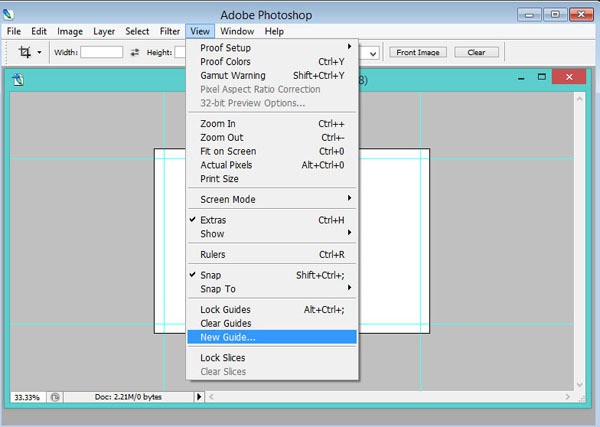
inserting guidelines in Photoshop
It’s important that you also work in CMYK colour, as that’s what the file will be printed in. If you work in RGB colour (which is what is used by monitors), when it gets converted to CMYK for printing some colours can end up looking very murky.
Graphic Design Basics
– Contrast. Use visual contrast to provide focal points in your design. Contrast in size, texture, colour, direction or shape can turn something monotonous into something interesting and beautiful. Don’t get carried away with too much contrast though; it can just end up looking messy.
Contrast is also important so that your contact details are easy to read.
When choosing fonts, the rule of thumb is to use only two fonts on any one document, three if you absolutely must. You can vary the size of the same font to provide interest and hierarchy.
– Alignment. Alignment is about building visual relationships on the page or frame; making sure everything in your design relates to something else on the page. If it’s out of alignment, it looks messy and ill-considered. It’s really as simple as making sure all your text is lined up (either centred correctly, or justified to the left or right) – break out some more guidelines to help you with this, or you can use the Alignment tools in Photoshop.
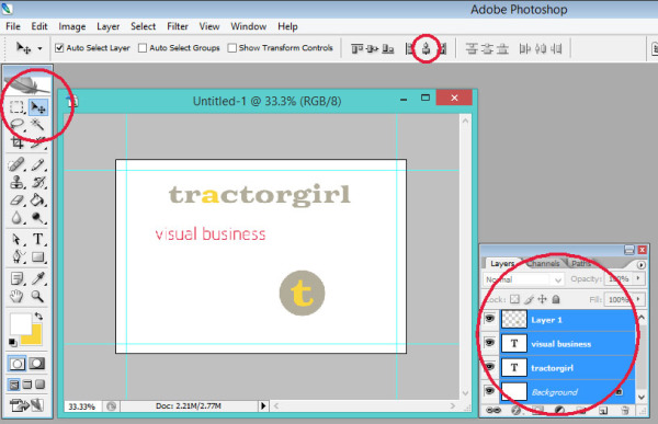
If you’ve got a layered image in Photoshop, alignment is simple. In the first image there are three layers plus background. To centre align them with the background, you need to select all layers. Select all your layers by holding the shift key down and clicking on them all.
Then, click on the Move tool in the top left, and then the ‘centre’ icon on the top bar.
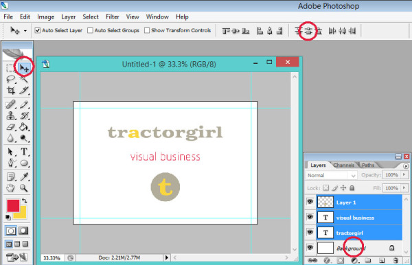
To distribute them equally down the page, you need to only select the layers you’re moving, so deselect the background. Then click on the ‘Distribute’ icon in the top bar.
Alignment can also be used with text to indicate a different level of information. By indenting text from the line above it, we indicate that it’s a different type of information.
THIS IS A HEADING
This is the explanatory text.
– Hierarchy. Creating a hierarchy in your design is helpful in communicating what is the most important information. We can do this in various ways – through the use of different font styles and sizes (e.g. italic and bold, or all caps), and through Alignment (as above).
When you’re using small fonts though, make sure you don’t go so small that it’s hard to read. Legibility is vital! Don’t make your potential customers work too hard to get your contact information.
– Repetition. Repetition of font styles, colours, shapes, etc., creates continuity and cohesiveness. Make it fit with your brand.
– Space. DON’T crowd your card. Leave space – it looks better. Less is more.
Space can also be a useful thing for either your customers to write notes on about you and your goods and services, or for you to write a short thank you to your customers.
FINALLY.
DOUBLE CHECK EVERYTHING before printing. Get someone else to proof it too.
It’s embarrassing and/or expensive to find that typo after they’re printed!!!
*
Have you got a great business card already? Or you’ve got an okay kind of business card but you’re not quite sure what you can do to improve it? I’d love to see! Feel free to hop on over to my Facebook page and post a pic of your card and promote your biz at the same time!
Or have you got a burning question about business card design (or any other kind of graphic design or branding question) pop a comment below and I’ll get you an answer. Your question might just be the one to help another small business too – share the love!
Julie x
I’m loving your inspiring words lately! Each story seems to match the stage I am in at the time- which is my newest start up venture in my brand new sparkly studio. My letterpress cards just got the final draft ok and I am so excited to see them soon. Thanks for your stories and latest e-book !!!!!
wow Lyn, thanks for the kind words! So glad you’re getting so much out of it. Yes, love letterpress, I’m sure cards will look totally beautiful, and all the very best for your sparkly studio. Awesome stuff! 🙂 🙂