YESSSSS a brand new series for you – and a short one so that you can get back to doing what you do best! Five posts on the five things I think are absolutely essential for branding your business, whether you’re selling a physical product or selling a service. Get these five things sorted, and you’ll be a very long way in front of your competitors. First one’s on Graphic Design Essentials.
*
Basic graphic design mistakes are something I see ALL. THE. FREAKING. TIME. And it’s really the main reason that made me want to get started in branding (soooo many ugly Etsy shops!). Because before your customers even get to your lovingly crafted words and inspect your lovingly crafted goods, that mess just stops them in their tracks. They’re too spoilt for choice, and something prettier’s only a click away.
I KNOW technology’s made it easy for us to DIY everything (yes, Google’s my friend too). But in this age of DIY everything in five minutes, there is a huge amount of excellent knowledge that’s lost in translation, with inevitably poor results. And bad-looking websites with terrible layouts and awkward graphics make me sad.
(OK, getting off my ranty high horse now.)
Now that I’ve said that, I would also like to say that these simple fixes are super duper easy. You don’t have be a graphic design guru to get these things right; heck, you don’t have to have any kind of design training – anyone can do them, with even the most basic of image editing programs.
ALIGNMENT.
Please. Make sure things are lined up. A header on the left and a thumbnail pic in the middle and a quote that’s kinda halfway across the page and random assortment of different sized pics doesn’t convey “free-spirited and creative” – it conveys “disorganised, messy, and unprofessional”. Yes. You’ve seen those websites too. And you’ve cringed a little bit, haven’t you.
It’s all about creating flow.
It has to be easy for your audience to absorb your message – if it’s all over the place, it just makes things that little bit harder for your audience. If things are supposed to be centred (like your name in your website header), make sure they’re actually centred. Don’t do it by eye; use whatever snap tool or guide functionality you have in your image editing software.
Likewise, make sure that when you use images in a straight line, that they’re all the same size (i.e. if they’re in a column, make sure they’re all the same width; if they’re running horizontally across the page in a row, make sure they’re the same height).
Text needs to be aligned properly too. If you’re writing a document and you want to put in sub-headings, make sure they’re all aligned with each other – whether that’s left or centred doesn’t matter so much, as long as you’re consistent through the whole document.
When you’re working with a space that is going to present only a small amount of information (such as a website header, a business card, or a social media graphic like an ad for Facebook or a pin for Pinterest, make sure it’s all aligned together.
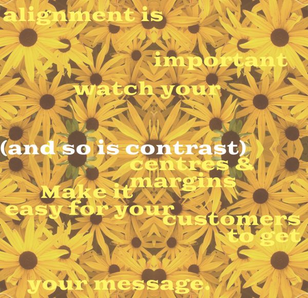
HIERARCHY.
Make the important things stand out more. When it’s text, and you’ve created variety through size, colour, italics and bold, think about what your eye is drawn to the most, and use that for your most important headings. Newspapers are experts at creating hierarchy within text – check out how they arrange their articles for headline, subheading, author byline, and article text.
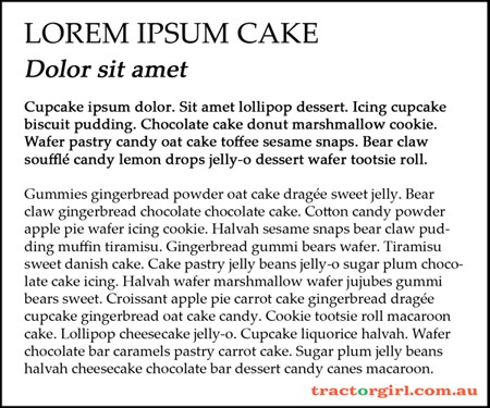
Also: “Show me where to click.” I love Seth Godin, and this little gem from him’s been stuck in my head for quite a while now.
You can use contrast to create hierarchy too – if your brand colours are mostly black and white with a pop of red, DON’T fall for the next-to-useless ‘make your BUY buttons red’ rubbish; you need to make them contrast so that they stand out, so make those buttons bright blue or green or yellow, so they pop!
NEGATIVE SPACE.
Don’t try and jam everything into the smallest amount of space possible. Your audience won’t know where to look. Too much choice = confusion and as I said before, there’s bound to be something prettier that’s just a click away.
Let things breathe. Surround them with enough space so that it’s easy to look at, and easy to read. Your products, your images, and yes, this goes for text too.
When you’re photographing your products, make sure it’s obvious what it is that you’re selling, and don’t crowd your shot with props. When you’re placing images on your website, ensure they’ve got a bit of blank space around them so that they’re easy to focus on without distraction. And break up a big slab of text with headings, and/or important snippets – solid slabs of text are for academics, not for your sales page, or for your “About” page.
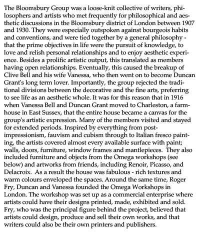
A BIG slab of solid text.
Boring, right!? Did you even read past the first line?
Let’s try it again –
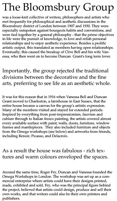
Now doesn’t that look a whole heap better? Think about it. You scanned the second article, didn’t you? And then you got intrigued by the fabulous house, and read a bit more. Ha! The text is absolutely no different; it’s all to do with layout.
*
OK, go fix up your websites!! Go on, I’ll wait 🙂
(And come back here and tell me when you’re done, ‘k? I’d LOVE to have a look!)
See you next week with the next tip.
(Update: You can find all the tips here)
Julie x
