Monday Mini Makeovers {part 5}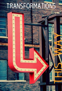
{image – Lulu’s Thai Noodle Shop by RedHedgePhotos.etsy.com}
Welcome to Part 5 of Monday Mini Makeovers! I hope you’re enjoying this series, but more importantly, I hope you’re learning some great stuff too! I know I am – the more I figure out what works and what doesn’t work for others, the more I learn about how I can improve my own biz. AND I get to meet some wonderful people and see some great products too!
So, in case you’ve been hiding under a rock or something and wondering what this is all about, this segment is aimed at showcasing the websites of creative micro-businesses just like yours, and giving them the once-over. For each biz I feature, I will give my honest opinion about my initial impressions of their site, with the idea that not only do these lovely people benefit from having a fresh set of eyes over their online presence, but that everyone who reads this can also get tips on how to charge up their own websites and shopfronts.
Would you like one for your biz too? You can! Monday Mini Makeovers are open to the public, so if you’ve got any sort of creative small biz and you’d like me to take a look at your online shop or website, read more about what to do here.}
OK, let’s meet this week’s lovely folk!
Belinda from Bell Designs
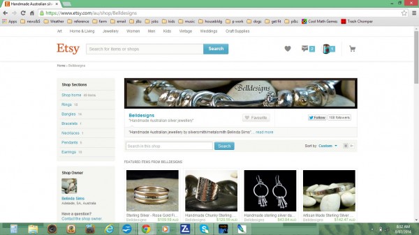
belldesigns.etsy.com
Hi to Belinda from BellDesigns.
Belinda has a beautifully crafted range of jewellery that she makes in her home studio on a rural property just outside Adelaide. She’s got some lovely work, and her shop is doing OK so far (excellent reviews with a 5 star rating is definitely admirable). I think just a few little tweaks will help her shop to really ‘pop’!
Most of Belinda’s work is in silver, and she has styled her product shots with various backgrounds to present a generally monochromatic theme to her whole shop – a range of white, grey or black stones, with the occasional hint of wood. This is fine, but it’s important to make sure that lots of greys don’t make it all too dark.
Starting with her shop banner, I would lighten and brighten the image; I would probably also turn up the colour saturation a little to show off the gold and make it seem a bit ‘warmer’. In the same way, several of her product images would also benefit from being brightened up a little – some of them are a bit dark, and/or need a bit more contrast to show them off. I would probably also limit the backgrounds to two or three types – consistency makes for a neater looking shop.
‘Bell Designs’ is a lovely name, evocative of bell-like sounds and everything lyrical and beautiful. It would be great if the shop banner reflected this a bit more – think of the flowing curves of many of the jewellery designs. Inspiration might come from the flowing lines of nature, using plants like lilies and ferns as a starting point.
With regard to her Policies page, the Welcome message could be improved. Don’t send your customers elsewhere for information – it doesn’t hurt at all to repeat your happy welcome and brief intro. Customers like to see friendly and happy! There are also a few typos and grammatical errors that should be fixed. If you’re stuck for what sorts of things to include or change, go to some of your favourite Etsy shops and have a read through their policies; after reading half a dozen or more, you are bound to get a better idea of what does and doesn’t work!
I love Belinda’s photo of the country on her About page! And it’s good to include general shots of the workshop and jewellery display. Cute puppies are also always a winner in my books – but I’d suggest getting them out and about in the countryside being happy – grab a great photo of them there, to re-emphasise the rural/handmade setting and convey a sense of how much you enjoy where you are.
It’s great that you give information about caring for your jewellery in your Shop announcement, but perhaps this info could also be included elsewhere? e.g on your policies page somewhere, and most certainly in a little info sheet when you post their order.
Now to the DESCRIPTIONS of items. I’m glad you give the definition of what gold-filled jewellery actually is, and how thick the gold is. Lots of customers still have no idea and might think that it’s actually filled with gold!!
Two other things would be helpful in each product’s description.
-
Your first paragraph is the most important one – give them a beautiful reason to want this item! If they like it, they will want to read more about it. For instance, your intro could read, “This is my most popular bracelet – called the ‘jingle-jangle’ because it makes such a wonderful sound when it’s worn!”
-
While you give the actual measurements of each item (and note, it would be helpful to list these in both cm AND inches), we all know that bodies come in many shapes and sizes, and so a link to proper measurement guides would be very helpful. Direct them to size charts somewhere, either on the web, or offer them as a printable PDF so they can figure it out for themselves. I have also seen useful pictures that show you how low different length chains hang around your neck .
Phew! I know that might sound like a lot, but really, each one is a general tweak. It’s the little details that add so much to the overall finish and professional presentation – for your items AND your shop.
Justine from Yarn for Baby
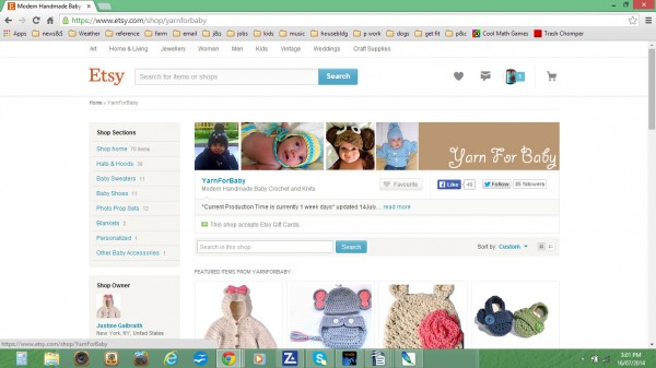
yarnforbaby.etsy.com
Hello and welcome to Justine from YarnForBaby.
Justine makes a very cute range of clothing and accessories for babies and small kids – I encourage you to check out her Giraffe set, or the Elephant suit!
Generally speaking, this is a very lovely, fresh looking shop. The product photos are good – clean white backgrounds, and colourful, bright clear images. One thing I’ve noticed though is that there are very few images of babies wearing the items. I know it’s not practical to have photos of your items being worn for EVERY product, but think about doing it for some – especially those items that are reproducible, and are made specifically for photo shoots. It could be a good investment in your business to collaborate with a photographer and get some great shots of a few different sets being worn (perhaps set on a pale background so they fit in with the rest of your photos). Do you have friends with small children you can borrow? Previous local customers that you can contact? Having the occasional picture of a worn set interspersing the ‘standard’ images will make your shop look more interesting and add some reality/depth to what you do.
Your shop banner would benefit from a little more consideration of your shop’s style. Certainly, it’s good to see some sets being worn here, but the images should be better than just snapshots – the lighting and styling is inconsistent. Think about what the feeling is that you want to convey. A professional looking banner will have consistent styling and colouring, and will convey a mood and say something about your shop – the logo and product images for a discount store are very different to that of a boutique. Spend some time looking around other online stores in your niche, and take notes of what you do and don’t like.
Justine’s About page gives an excellent description of who and what she is, and how much crochet means to her. If she could add the same enthusiasm and passion to her Policies’ “Welcome” section, that would be awesome! It doesn’t have to be more than 1 or 2 sentences, but it would really lift it.
Getting yourself noticed is not just about having a good-looking shop either (although it’s certainly part of it). When you use Social Media, really USE it! Share things from around the internet that interest you; ask questions (not just about your products) – get your customers to talk about themselves, and get a sense of community happening. There are lots of other ways to connect with customers online too – I talk about a few here and here.

Now it’s over to you readers again!
How did YOU go with all of that?
Can you think how the suggestions I’ve made today could be applied to your biz? What would you change? What would you keep the same? Have I still not solved your problem for your biz? Maybe the previous Monday Mini Makeovers might help. And as always, if you’ve got a specific question let me know in the comments below. – I’m more than happy to help anytime!
AND, if you would like a Mini Monday Makeover on your biz, you can join in too – all you have to do is pop me a line at info@tractorgirl.com.au, with a link to your shop. If you want more information about how the MMMs work, you can read about them here.
See you then!
Julie X
Thanks so much Julie. I really appreciate your comments and the time it has taken you to makeover my shop. I will certainly be making some changes.
Kind Regards Belinda
It was a pleasure! I’m very glad to have been able to help. And thanks for sharing your shop – I’m sure it’s helped others too.
All the best, Julie 🙂