
{undergoing renovations – photographer unknown}
Welcome to Part 4 of Monday Mini Makeovers! This is where I showcase some websites of creative micro-businesses just like yours, and give them the once-over. {And hey, I know it’s Tuesday’n’all, but life’s sometimes messy… ha! so apologies 🙂 }
For each biz I feature, I will give my honest opinion about my initial impressions of their site, with the idea that not only do these lovely people benefit from having a fresh set of eyes over their online presence, but that everyone who reads this can also get tips on how to charge up their own websites and shopfronts.
{And if you’d like to get involved yourself, you can! Monday Mini Makeovers are open to the public, so if you’ve got any sort of creative small biz and you’d like me to take a look at your online shop or website, read more about what to do here.}
OK, let’s meet this week’s lovelies!
Sonia from Happy Spirit Handmade
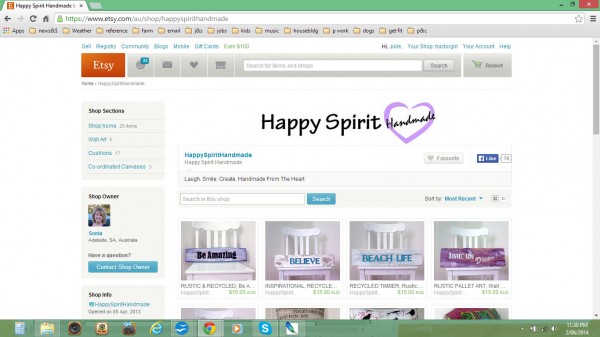
Hi to Sonia from HappySpiritHandmade.
I’m glad that you’re a happy spirit! The world needs more of it. But your shop banner needs to shine and express that too.
Your shop banner is your “Welcome to the shop”. What kind of feeling do you want to give to your customers when they step in the door?
Use some more bright, fun colour, with radiating lines, like sunshine! I think your banner feels a bit blank at the moment. I would also try some more inventive fonts. There’s oodles available for free on the internet – just have a poke around and see what you like!
Your product photos would benefit with a bit more attention. Your lovely signs don’t look at all natural sitting on a chair. If they’re intended to go on an outside wall, then see if you can find an outside wall to hang them from. Or even prop them up on a wooden fence. Spend some time shifting them around your yard and house to find the most appropriate backdrop and the best lighting. In most cases, in the shade outside in daylight is best.
Several of your photos are too dark and suffer from colour cast (they all look a little blue to me. Use Photoshop or one of the many free online image editors such as PicMonkey or Pixlr to lighten and brighten your pics. (It’s something I do to pretty much ALL of my pics – brighten them, up the contrast and then tweak the colour balance to get more realistic colour). {Jess at Create & Thrive has some AWESOME photography tips, including a case study.}
I also think your prices are too low! As makers, we often get trapped into thinking we have to ‘compete’ in the marketplace by providing our wares at the lowest possible price. This is SO wrong. You are not a sweatshop, and you are not competing with bulk-manufactured goods. By pricing your goods too low, you are also doing other makers a disservice, by reinforcing the expectations of the consumers that that is how much they should pay for handmade. Increase your prices!!
You not only have to think about how long it takes you to source the fabrics, how much the materials cost and how long it takes you to make the item, but you also need to consider the other ‘hidden’ time and effort – things such as styling and photographing your item, time spent writing descriptions and listing on Etsy; then the time spent packing and posting your orders, doing your accounts and all the rest of it. It’s a whole business that the product is only a small part of.
I’ve seen a few useful guides to pricing around the interwebs, so feel free to google around and see what others have to say. Pricing can be a very complicated and difficult part of the biz for small creative biz. Create & Thrive got several makers to say how they dealt with pricing; and Ink & Spindle gave an excellent discussion of the matter, and proposed a simple formula for the basis of figuring out your price.
Melissa – Sweet Never Endings
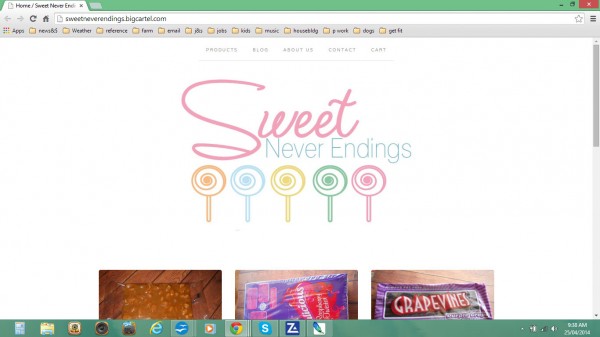
Hi to Melissa from Sweet Never Endings. {Melissa lives just down the road from me in Griffith, NSW!}
Firstly, your logo is lovely! Pastel-y and sweet, and reminiscent of childhood treats.
But the very next thing that strikes me is your product photos. Your choice of a wooden table as background is very dark and heavy and doesn’t really suit your light and happy logo – a plain white background would probably be better. I also think that part of the problem is that your products are photographed at all odd angles, and it makes your shop seem a little untidy. Perhaps you could photograph all your products from directly above, so that they are all square? Or, you could make your products look more inviting by styling up your pics – e.g having a small bowl of the sweets next to the packets (if the branding of the sweets is important to your product). And you need MUCH more information about your products! I couldn’t even see a size for your peanut brittle.
Looking at it a bit broader, having your own .com says HEAPS about your professionalism. We’re dealing with perceptions here – and so if you include the .bigcartel.com extension which everyone knows doesn’t cost anything – well, it says something about your biz. Domain names are cheap, and web-hosting is very reasonable (and defs, shop around! There’s lots of providers out there, with varying levels of service).
I noticed you said you stock pinatas and party supplies – well, you definitely need to put these up too! Some photos of happy customers would be awesome, as would some written testimonials. It’s all part of sharing with your customers what makes you a special place; what you do that is different to everyone else. Go check out some other sites in your niche and have a good hard think about what YOU like reading on other people’s web sites; I know I always love to go straight for the “About” page. So spruce it up! Tell a great story, and half your battle is already won.
Getting your name out and about should ALWAYS be part of your strategy.
There are lots of different social media platforms,and you need to figure out which one is best for you. Where are your customers mostly likely to hang out? Concentrate on one or two, as nobody has time to do all of them (and it’s not very productive either). Certainly, on your contact page you could include links to your Facebook page and other social media, as well as your normal email address (not everybody likes using the contact form), and your postal address, if appropriate.
Another EXCELLENT method for getting your name about is to do a few guest blog posts. You can expose your name to a whole new audience! Find other blogs in your niche, and write about some aspect of the biz that you’re involved in – a tutorial, some aspect of the biz that bugs you, something that inspires you, or even a roundup of other people’s work you admire. Also, spend time commenting on other people’s blogs – and not just naf things like “awesome!” or “love it”. Provide thoughtful feedback, and the bloggers as well as other readers and commenters will come and check you out. If your comments are interesting enough, you will have a whole new tribe of adoring fans reading your comments and visiting your blog.
Enormous thanks to today’s participants! Thanks for putting your neck out there, and thanks for the opportunity to share some of your solutions.
Now it’s over to you fabulous readers again – how did you go?
Can you think how the suggestions I’ve made today could be applied to your biz? What would you change? What would you keep the same?
Have I still not solved your problem for your biz?
If you’ve got a specific question let me know in the comments below.
AND, if you would like a Monday Mini Makeover on your biz, you can join in too – all you have to do is follow the instructions over here.
Catch you next time!
Julie X
Sonia,
Cute shop!
I’d have to agree, your prices could be raised and you’d be just fine.
I want to add, an issue with your titles. In some titles, you aren’t mentioned what the actual item is until the end of the title. I would try to move that to the front of the title. You can make your title longer too, this gives you more words that will be searchable. I would also have the tags reflect the same word and word combinations you’ve chosen in your titles.
Is there a reason you’re only shipping to Australia? That will really restrict your sales. At first I was concerned with international shipping, but it is so much easier than I thought. Many of my customers are international.
Have fun!
Thank you Julie for your thoughts on Happy Spirit Handmade! So I have quite a few things to work on…I’ve lost count of the number of times I’ve re-done my photos! Lighting is the hardest thing and also trying to keep some sort of uniformity across all the pics. I have a new website and really want to get things right so will take on board what you have said about my logo too. I really appreciate your comments and am going to get to work on your suggestions.
I know Sonia, there’s ALWAYS so much to improve upon – just keep the long-plan in your head! My favourite saying is “If you keep going, you’ll get somewhere.” X