What was your favourite colour as a kid? Mine was always yellow – I couldn’t finish colouring in a picture unless it had some yellow in it somewhere; it always just looked dull. These days, I’m much more open to all the colour combinations; each palette has its own particular mood to convey (but notice I’ve still got yellow in my branding, haha).
Carrying on from last week’s post (here), we continue looking at the multitude of ways you can use to come up with the perfect palette for YOUR brand.
You can make your own palette from scratch in various ways. As noted in the last post, ColourLovers.com is a great place to go and play with colour. They’ve got a great online community there too, so you can share the palettes you’ve made, AS WELL AS apply them to patterns … also made by you! (and others. Go on, it’s totally addictive.)
HTMLcolorcodes.com is a modern take on colour pickers, and it’s a bit geeky if that’s your thing. It provides you with the ability to make up you own palettes from scratch, and gives you auto options to choose more colours by changing the criteria (e.g. complementary, triadic, tetradic, etc), so I do feel it comes from a designer’s perspective, and assumes that you already have some knowledge of colour. Having said that, it does include some very nice tools, colour charts, and tutorials on using colour within HTML, CSS, and SCSS.
Extracting colour from a photo
One of my very favourite methods of getting a great palette is to find an image that really, really nails who and what your brand is. (It doesn’t matter if it’s not your image – you’re just using it for inspiration, and this exercise is a totally private one.) When you extract the colours from an image like that, it should be pretty darn close to the perfect palette for you. For example, if your biz personality is bright and fun, and you’ve got an image of a fairground on a sunny day, chances are you’ll find the colours that you need right there.
If it’s already a digital image, great. If not, get it onto your screen somehow. Next, go to any one of the many colour picker sites online – such as pictaculous.com, cssdrive.com, Lokesh Dhakar’s color-thief or palettefx.com. However, my fave picker is Adobe’s, at color.adobe.com and you’ll see why in a minute. (ALL of these generators will provide you with at least the hex-code of your colour – this is the 6-digit identifying number (denoted by the hash key #) so that you’ll always get EXACTLY the same colour every time you use it.)
Start by loading up your photo (on color.adobe, the link to load is at the bottom of the page), and let the generator do its thing. Now in Adobe, the big advantage is that once you’ve loaded up the image, it will show you the points it’s used for sampling – and you can move them around to tweak your palette. Alternatively, you can change the ‘mood’ from the drop-down menu on the left. Once you’re happy, you can either save it (if you’re an Adobe member), or click on the little colour-wheel icon on the right and it will take you to the colour wheel, where you can tweak some more, or just find the hex codes for the colours you’ve got. Easy peasy!
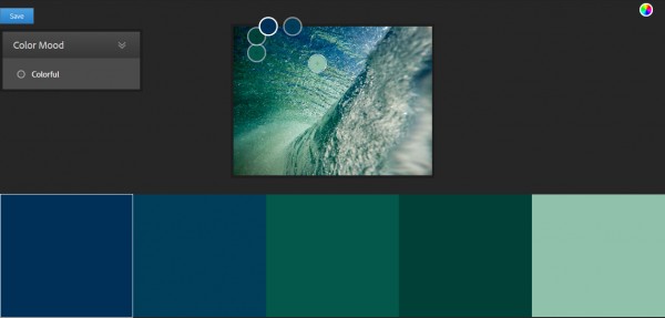
using the adobe colour picker
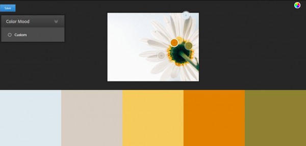
using the adobe colour picker
Some basic colour theory
There is OOOODLES of stuff about the theory of colour out there, and really, you don’t need to know anything beyond the basics.
The technical terms you will find most helpful are these –
* Hue is pure colour, and includes all the colours in the spectrum (red, green, blue, etc).
* Value is to do with how dark and light it is – from almost white to almost black.
* Saturation is to do with how pure the colour is – it runs in a scale from the purest colour, through to almost entirely grey. (Consider also, that each hue has a different value – red is much darker than yellow, and that is why when you change the saturation on each of those colours, a different grey value will result.)


Start with the colour wheel, you The most basic method of choosing colours is to start by looking at the hue i.e. pure colour), and the relationships that you can form around the colour wheel.
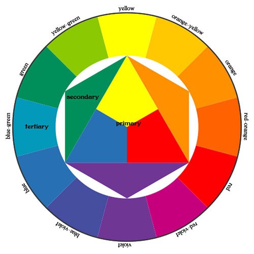
One method of choosing colour is to use balance. Pick two colours directly opposite, you’ve got balance. Make a symmetrical triangle, and you’ve got balance. Make a square or rectangle, and you’ve got balance. Tweak those hues with value and saturation, and you’ll still have balance.
Another method is to choose colours next to each other on the wheel – because they’ve got a hue in common, they’ll look good together. Again, tweak those hues with value and saturation, and you’ve got yourself a useful palette.

As noted, there are TONS of ways you can come up with colour; it entirely depends on your brand and what mood you want to convey, that fits your business personality.
A last word on choosing colours for branding.
A very important thing to remember when you’re choosing colours for your palette is that these colours will be used for all sorts of things – text, backgrounds, borders on images, highlights, buttons….. and so much more. SO you’ll need to make sure it’s a useful palette. Ensure you include at least one dark colour, and one light colour, and that there is enough contrast between the different combinations.
OK, have fun!
*
Oh, and p.s., I would LOVE you to tell me what your fave colour was as a kid, and if it’s still your fave now. Do you use it in your biz brand? Or would you consider it for your brand? Leave me a comment below, and tell me what your biz is, too!
Colour-junkie Julie x
Not sure about as a kid but orange and purple have resonated with me for a very long time. Add green to that now too 🙂
Aaaah, green is one of my favourites!! Love a deep mossy green, and the bright chartreuse of spring grass in the sun. Thanks for sharing!
My favorite color is always orange. I couldn’t finish colouring in a picture unless it had some orange! this is a great app for web designers. thanks for sharing
Awesome Jeremy! Such a cheery colour 🙂
You know my branding colours because you chose them, from me just showing you a few pictures of what I like and you nailed it. My favourite colour is red and always has been since I moved from girly pink as a 10 year old. And I love the red that’s in my branding!
Hi Kay, so happy you’re so pleased! And yes a crimson-y red is my favourite kind of red too 🙂