Carrying on from Part 1 here, in which we looked at things to watch out for when choosing a font (like why you would pay for one when there’s so many for free), here we’re digging into the specifics of font shapes, and how/why they convey the feeling they do.
Let’s have a look at a couple of fonts in detail.
You know that serif fonts are the ones with little ‘feet’, and as a group, they generally convey ideas such as “classic” and “conservative”. But what if you have a business personality that is classic, AND dynamic? You want something with a bit more pizazz.
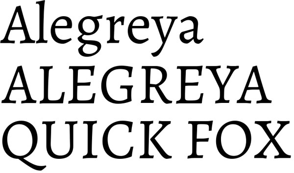
Alegreya is certainly classic. But there’s something a bit more interesting about it, right? Let’s look closer.
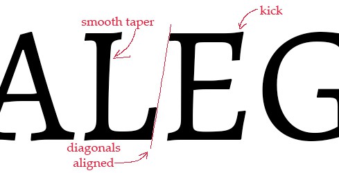
All the corners are crisply finished; this gives us ideas of precision and attention to detail. Anything with diagonals is perceived as ‘active’, and nearly all the serifs are not only finished diagonally, but are parallel. Strong uprights such in the “L” and “E” are evenly tapered, slightly thicker at the top, and the tail on the “Q” is generous. Altogether, the strong alignment, the crisp corners and smooth tapers convey ideas of well-organised, strong, and systematic, while the kicks on the serifs and the inclusion of diagonals conveys sharp innovation.
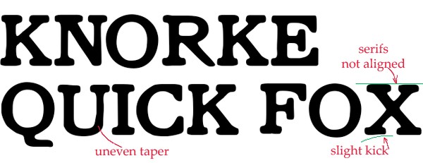
Knorke is also a serif font, and in many ways classic. HOWEVER, it’s a totally different kettle of fish to Alegreya. Knorke is trickier, more lively, and even a teensy bit subversive. Look closely, and you’ll see uneven serifs, wobbly tapers, unaligned strokes, and outlines aren’t smooth. It also has no crisp corners; it looks a bit stocky and a touch overweight, like Mundungus Fletcher. All adding to that feeling of being a little bit less predictable.
Add a bit of fun
Of course, if you want to be totally subversive, go all-out whacky with your font. If you just want to add a bit of humour, you might want to try something like these –
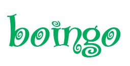
Note that each of these fun fonts includes tightly wound curls – it’s a whimsical and lavish flourish that’s both generous and friendly. The roundness of Boingo, its curves in both serifs and uprights and the fact that it ignores the baseline (the imaginary horizontal line that all the letters sit on), all add to its loud, bouncy, upbeat nature. Great for if you’re selling kids toys.
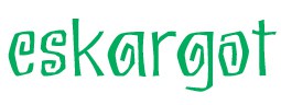
Eskargot on the other hand, is a bit quieter. It sits well on its baseline, and its uprights are straighter (although not quite…). It’s still very definitely funky and upbeat, with uneven strokes, slightly off angles, and crooked lines making it look fresh and lively. You might want to try something similar if you’re selling unconventional jewellery, or even cute plants.
So, next time you’re agonising over “WHICH FONT?”, stop; zoom in, and take a much closer look. Look for angles/straightness, look for look for tapers/parallels, look for smoothness/unevenness – and think hard about how all that makes you feel.
One last word for today. Don’t use the fonts that came on your computer for any of your graphics (you know the ones I mean – Times New Roman, Arial, Verdana, and the like) – they’re about as interesting as a stale biscuit. And don’t EVER use Comic Sans. For anything. Because it’s ugly.
*
Stay tuned! After a question from Jess on my Facebook page recently, next week we’ll be talking about how to pair fonts – for when you need more than one to say what you have to say. There are definitely techniques to this!
If there’s something YOU’D like to see here, or any questions you’re curious about, drop a comment and ask me here, I’d love to help out.
See you next time, Julie x