Welcome to the next post in my series on the Elements & Principles of Design! The purpose of this series is to get makers/designers/artists of all descriptions to think about exactly what it is about their work that they love, and what could be improved. There is never any one right answer, and there are always infinite variations. But all of us agree that some things look better than others (even just a cursory glance through Etsy will tell you that!), and I’m here to help untangle the reasons why.
Today’s how-to is about Tone. Sometimes it is referred to as Value, it is the contrast between light and shade.
The light and shade in a piece can be muted with low contrast, or bold with high contrast; it can be graduated, and used to convey a sense of depth. It can also utilised to convey the mood of a piece.
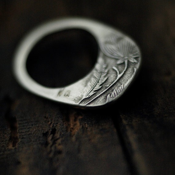
This beautiful silver ring uses tone through its embossed form. Not only are natural shadows created by the raised surfaces, the effect is enhanced by blackening the lower surface of the silver slightly, thereby especially showing off the lines in the feathers and the flower.
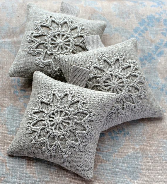
Again here, the tone is mostly a by-product of the shadows created by the crochet on the weave. However, there is a slight difference in the two colours, and the paler thread is more noticeable at the centre of the crochet. Overall, the effect is very muted though, conveying a soft and romantic feel.
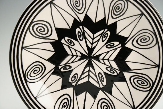
Boldly graphic, high contrast is all there is on this plate, and it is used well with strong lines and simple shapes. Overall, the effect is bright, fun, and a little bit dramatic.
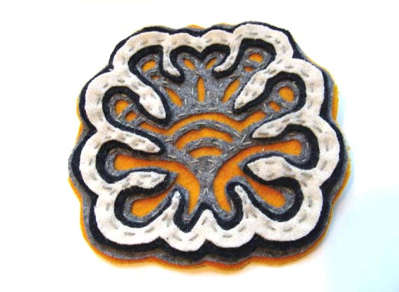
This great little felt brooch uses high contrast to emphasise its shape. It is important to note that colour also has tone (and more usually, it’s referred to as colour value). The value of the pure colour itself depends on its hue – yellow is quite light, while purple is dark. And so, the orange felt of the background provides great contrast because of its colour, but really, its value is not very much different to the mid grey of the layer above. (I will be talking more about colour, with its tints and shades, as well as its saturation or intensity in another post soon.)
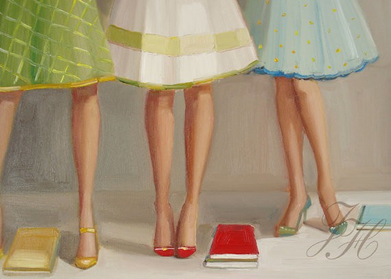
While the colours in this curiously fun painting are reasonably pure, overall, the tone is softly muted – the shadows are not intense, and neither are the highlights very bright. This softness conveys a sweet and feminine gentleness.
The tones in this stunning image have been manipulated to intensify contrasts and give a fabulous strength to the composition. There is still gradation of the tone (which is what conveys a sense of roundness and solidity when we look at an image), but the heightened contrasts lend an incredible drama and majesty to the work.
*
I hope you have enjoyed my picks for this post, and that it made you consider tone just that little bit more. I look forward to sharing the next Element with you – SHAPE!
Do you have any questions about your own work? I would love to hear from you! Leave me a comment here, or feel free to shoot me an email – info@tractorgirl.com.au.
Julie x


Can you email me with some hints about how you made this blog site look this awesome, I would appreciate it.
I use to study photograph back in my school days and there was nothing I loved more than creating dramatic black and white tones in the darkroom. Either to my teacher’s delight or dismay! 😉
There’s just something about bold patterns that draw me in every time though I do love soft and subtle tones like you show in the ‘Library Ladies’ painting. Janet Hill’s work is so beautiful.