Welcome to the next instalment in my series on the Elements and Principles of Design (you can find the rest of the series here) – and welcome to the first Principle that we’re covering – Repetition!
Repetition is a fabulous thing. You can use just about anything in your design – the oddest colours, the whackiest shapes, – if you tie it all together through repeating elements. It gives your composition deliberateness, which is a key to making something appear cohesive.
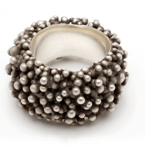
Lets have a look at an example that uses repetition in a simple way to great effect. This ring by Nora Rochel is covered in multiple beads of silver, slightly varying in size. What a fabulously tactile result! Not only does it create a visually unified surface, but when a something is covered in similarly-sized and shaped elements (or pattern), the overall effect is one of texture.
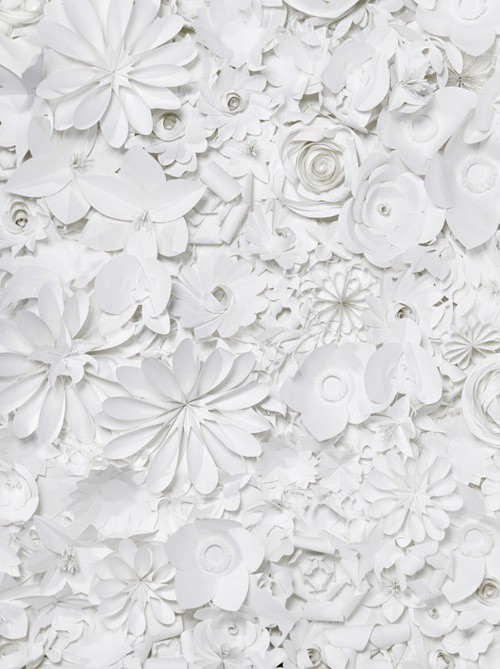
Repetition does not have to be just using the same shapes – if the colour and material are the same/similar throughout a piece it can look incredibly effective too. Love this work from paper artist Sabrina Transiskus.
This wonderful collection of African spoons further demonstrates that items do not even have to be the same colour, shape or material. Placement is important here – they are all placed vertically, and are spaced evenly over the whole of the image. And of course what also works here is that the collection is based around a single concept – they are all spoons, with a bowl and a handle.
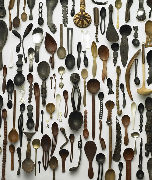
a collection of African spoons {from the exhibition ‘1002 spoons’ by Jurgen Lehl, via www.shearyadi.com}
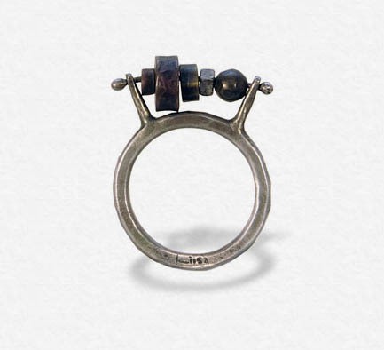
If you think about what Repetition is, then you can play with the idea to create points of interest in your work. For instance, if you have number of repeated elements, using one very different element can provide an intriguing point of interest, as in the ball-shaped bead on this ring by Liisa Hashimoto. Of course, the largest wheel-shaped bead draws your attention too, simply because it is the biggest, and this adds to the intrigue.
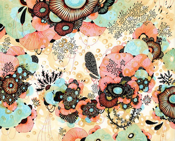
Sometimes you come across a piece which looks wild and chaotic, and it makes you wonder a bit why it still works. The illustrations of Yellena are often such a wild collection of colours and shapes, it’s a little hard to know where to start. You need to step back a bit and have a more considered look. Firstly, the palette of colours is not as wild as you think, and are based around only four – orange-red, turquoise, and ochre, with an overlay of black. The space is also dominated by many organic round shapes, most of which have a similar substantial turquoise spot in the centre; and many have some kind of stripes radiating out from the centre. There is also a series of these shapes which all have a similar size, running in a fairly simple band across the bottom third of the image, and these provide a good balance to the larger shape at the top of the page.
Yellena skilfully uses repetition of the Elements of line, shape, colour, and size to give a gorgeously vibrant result – there is plenty to look at, without getting lost in the territory of overwhelm.
Now just a caveat here – like all Elements and Principles, Repetition is a magic thing that can be used for good or evil. By that I mean if it is overused, it can look quite ugly, or worse, it can simply look boring. So be careful how you wield its power. It is only one technique (Principle) that you can use with the tools (Elements) in your Design toolbox.
Have fun experimenting! Next up in this series is using CONTRAST – stay tuned.
*
And if you’ve got a project that you’re proud of, that uses any of these Elements and Principles, I would LOVE to hear about it! If you’ve got a pic of it up online somewhere, please add a link in the comments below, so you can show it off!! ![]()
Seeya, Julie xx
