This post is the second in a continuing series on the Elements and Principles of Design (more to come soon!). (First one on Texture is here.) As I said in that post, I have found the Elements and Principles a very useful way of looking at design, and very helpful in making visual decisions about any project, images, objects, or spaces to produce something you’re proud of.
Line –
Can be an actual line drawn, or can be the line formed where two surfaces/space meet. It can create texture; it can be thick or thin, soft or hard. Line is also closely aligned with the other elements of shape and direction – lines always have a direction, and shapes can be defined by line. Line can be used to draw the eye through and around in the design, so can be very useful in giving cohesion to a design or image. To explain, again I will pick a few things from Etsy, and talk about them a little.
This gorgeous photograph contains very strong diagonals, and is given elegance through the sweeping curves of the banister. The flow downwards ends in a tight swirl onto the broad lower steps – perfect for a grand entrance. Notice also, the clock’s hands are parallel to the banister. This detail might seem a small touch, but imagine if the hands were in a different position, and what that would do to the overall quality of the image. By the way, in Western societies we tend to ‘read’ images from left to right, and from top to bottom, because that’s the way we are taught to read text – hence our eyes travel down the stairs.
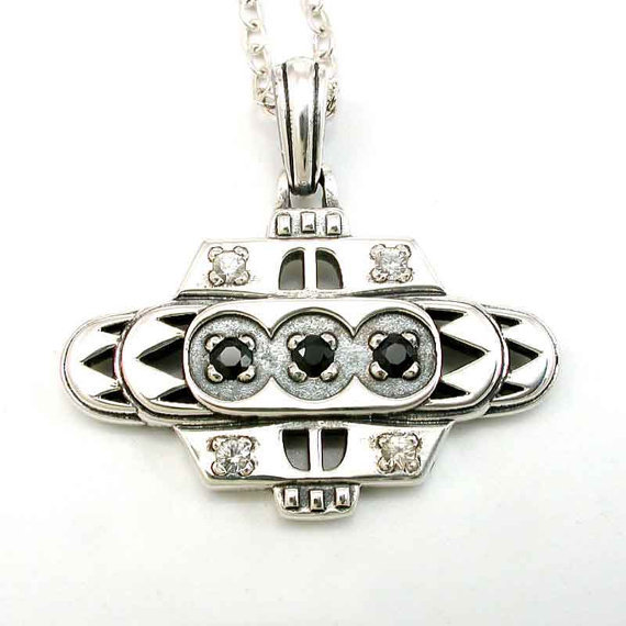
The design of this distinctive pendant is based on the Art Deco-style Chrysler Building in New York. It is characterised by layered geometric shapes, lots of parallel lines, and strong symmetry. Although horizontals are emphasised in this design, it is balanced by the vertical centre line formed from the large link at the top through to the bottom.
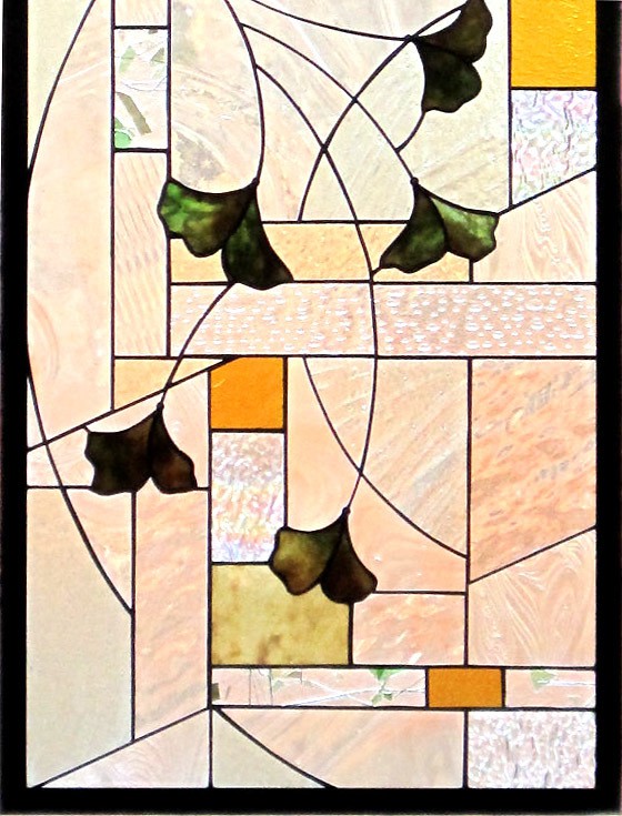
Despite the break in the actual line of the curve on the lower left of this glass panel, the flow of the line is not broken. Our eyes still follow the line down, skipping over the break. (The artist has used this technique elsewhere in this panel too.) The graceful curves of the leaf stalks are a nice contrast against the very blocky background.
The lines through the arches in this image are much softer than the other examples above, as the ones here are broken up by the leaf shapes. We still see them though, defined by darker layers against lighter layers, and they are very much part of the strength of this picture. Our eyes follow the flow of the concentric arches over the top and around, drawing us closer in until they spiral into the centre.
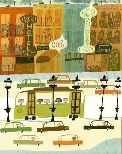
In this image, the hand drawn, not perfectly straight lines and shapes are used to add a quirky and lively feel to the piece. This image is also an example of where the strongest lines are pretty much formed by the shapes – there are lots of vertical lines formed by the buildings, windows and signs, as well as the lamp posts in the lower section. However, these many verticals are counterbalanced by the dramatic horizontal line formed at the lower edge of the buildings, where it suddenly changes in colour from brown to cool grey. The strength of this line also comes from the fact that it is unbroken – nothing crosses it, and it effectively cuts the image in half. The several shorter horizontal forms of the cars break up the lower space and help to create a sense of movement.
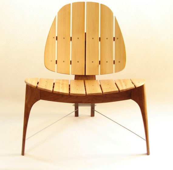
In this chair, strong, clean lines and symmetry dominate, with soft curves providing a sense of calm and comfort. The simplicity really shows off the beauty of the wood, don’t you think?
As always, I could talk a lot more about each of these pieces! But instead, I’ll start thinking about my next post in this series – what would you like me to investigate? I’m thinking about scale(size) or tone…
Cheers, Julie x
(P.S. – Each of the images link back to that shop – just click on them to be taken there.)

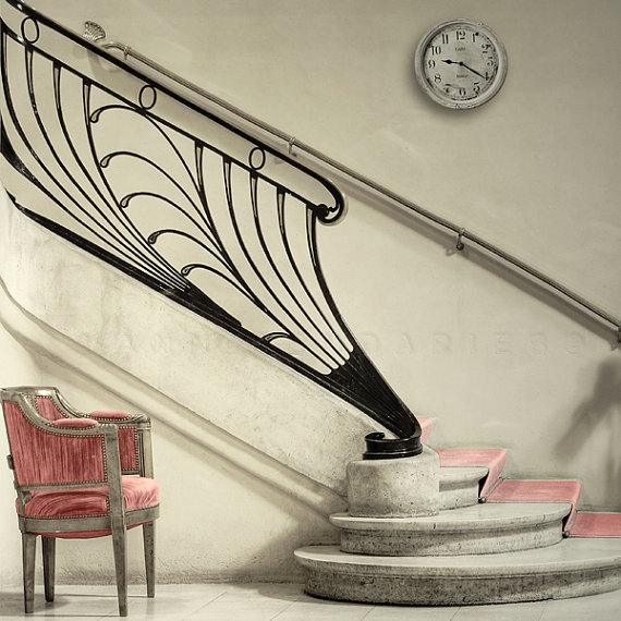

Thank you very much for sharing my photograph, to illustrate your line concept , it’s very interesting!
ALl the best,
Yann – PhotographyDream
Hi Julie, enjoyed reading and learning from your analysis. Keep it coming! Love informative articles on design.
Thank you for taking the time to write such an informational post! I would love to read more of these, so I’m very happy to have discovered your blog. Great stuff!
-Amberly
http://www.ambsgoodlife.blogspot.com