Product Photography
When you buy things online, exactly what is it that compels you to press that “BUY” button? Especially when you can’t pick stuff up, turn it over in your hands, feel its weight, feel its texture? There are of course a number of reasons, but online, a big part of that ‘thing’ is the product’s IMAGES.
When you’re a maker, it should go without saying that your product image should be well lit with no harsh shadows; horizons and other alignment is straight, and there is ample space around the product so that the picture doesn’t look too cramped. There are tons of tutes out there on how to get all the technical stuff right; I’ve written about it over here, and I also particularly like this one from Jess over on Handmadeology, or this excellent one on the Etsy blog.
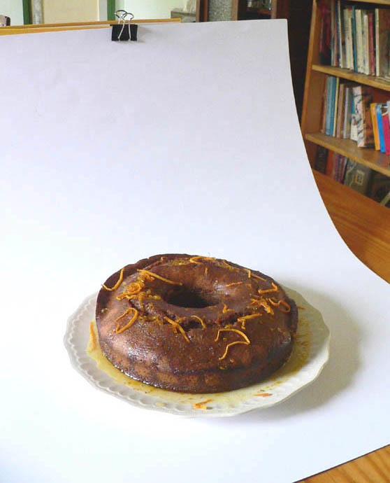
easy peasy infinity ground
SO THIS IS IMPORTANT:
A good camera won’t instantly make you a brilliant photographer.
You’ve got to have a good understanding of what you’re doing and have a clear idea of the result you’re after in order to get consistent results from your camera. Conversely, even if you’re only working with your smartphone, you’re still capable of achieving some very good results.
THIS IS ALSO IMPORTANT:
Please don’t ever think that taking one snap and uploading it direct is a thing.
Before you get even close to uploading your pics to your shop, you need to figure out a few things about your image style.
Start by thinking about your business personality.
Consider what the lighting is like in those images. Is it strong and clear, soft and romantic, or somewhere in the middle? What’s the composition like – are they full and busy, or serene and uncluttered?
Most of the time, a lot of props and/or a complicated background are a bad idea. They confuse the image, and the viewer doesn’t know where to look. Also, if your style is modern and minimal, you’ll probably want to keep things simple on a plain background.
Always always always keep your business personality in mind as you go through the different aspects of product photography below.
Composition. The first thing to remember about your photograph is that it’s in a frame, and therefore it’s a composition (remember that word from high school art classes?). So, you need to think about how to purposefully compose your photo. As noted above, don’t make your item too large in the shot (it looks cramped and uncomfortable) or too small (it looks lost), and keep props to a minimum.
When you’re cropping, keep in mind your pictures don’t have to be the standard height to width ratio! You can crop them to square, or shorter or thinner – whatever suits your object. Cropping also allows you to easily get rid of extraneous detail at the edges (like the edge of the verandah, that lens cap you left on the bench…), as well as allowing you to rotate the image to straighten up slightly crooked horizons. (YES. Please make sure your horizons are straight!)
Props. The most important rule is always Less is More.
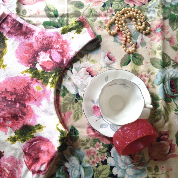
Seriously, what’s for sale here?
(Hint: it’s the shirt. But you looked at everything else first, didn’t you?)
So what’s wrong? Let’s see…. Think about what draws your attention first – it’s the white teacup, because it contrasts with the busy florals. The pink bangle stands out for the same reason. And not only is the shirt is only partially shown, but the background floral is just as busy as the pattern on the shirt, and therefore it just gets lost.
Now you’ve got that, we can move on 😉
Props can play a wonderfully supporting role in your image. You might need to hang your earrings from something, or you might want to spice up your simple block of handmade soap with some fresh herbs or a flower, or put your kids toys next to a floor rug.
Whatever you do and however you set up your shot, look through the camera lens critically and ask yourself, “Does this look too busy? Is it obvious what the thing for sale is?” If it’s too busy, keep on taking things out until you’ve got the absolute minimum props (…just like your mum told you about wearing jewellery when you were young, “Take one more thing off”).
The trick is to make everything in your photo look like you’ve thought about it.
When choosing props, always go back to how you described your brand personality to decide what mood you’d like to convey. If it’s bold and sassy, you might try adding a touch of black or red; if it’s super soft and feminine, you might try adding in some tiny flowers, and use pastel backgrounds.
Editing. In my experience, most images require editing of some description. I ALWAYS adjust contrast and brightness; the aim is to have bright, clear images where it’s easy to see colour and detail.
If low light is a problem for you, digital editing is great for adjusting brightness and contrast, and correcting colour. (However, nothing can fix a blurry photo, so use a tripod or stand for your camera if shake is a problem for you.)
You can also change the colour balance to get rid of colour casts (like when your pic looks too blue or orange), and use the rubber stamp tool to get rid of minor blemishes (such as that bit of fluff you didn’t notice when you were shooting!). I use Photoshop, but if you don’t have it, there are lots of free web-based photo-editing programs out there, such as PicMonkey or GIMP.
Adjusting lighting to suit your style. While I don’t encourage you to alter the colours of your images so that it misrepresents what you have for sale, you can still tweak things to suit your brand style.
For instance, if your style is warm and beachy, you might make your pictures a touch brighter than normal, and tweak the colour slightly to bring up the yellow and orange hues. If your style is mystical, you might want to make your photos slightly darker with higher contrast. Or, if your style is shabby chic and romantic, you might like to soften the contrast, and brighten the image.
Once you’ve figured out your image style, stick with it. As I said earlier, most importantly your images should be in focus, well lit, and not cramped. Tweaking your images should be just that – tweaking – and certainly nothing that’s going to misrepresent your product.
Mixing it up. OK, so now I’ve got you all clicking along happily, feeling comfortable and confident, it’s time to mix it up again by adding in a bit of variety.
NOTE: THIS IS NOT YOUR EVERYDAY-GARDEN-VARIETY VARIETY.
This is purposeful variety that fits with your brand, and is designed to add the personal touch. Including real people in your photos can be a big help – for instance, if you sell beachwear, have a couple of shots of happy people wearing your creations at the beach. If you sell jewellery, have a couple of pieces displayed on the body. On your shop’s main page, a couple of people pics amongst 20 or so other product shots will not only demonstrate what these things look like on the body, but because people relate to people, will also add some friendliness/approachability to your shop.
Of course, not every product is suitable for this – you can’t wear graphic design, or furniture. You could however include images of people using your products… or not! Do some research and check out other shops in your niche and see how they style their pics. Which images do you like? Why? How can you extract elements of that and put your own spin on it?
*
Improving your photography takes a little bit of knowledge, some good hard thinking, and practice practice practice – you’ll ONLY get better with the doing!
Whatever you do, I’d love to see some befores and afters!! If you’ve been around a while and would like to show off your pic from a couple of years back, and your (vastly improved) one from more recently, drop me a link. If you’d like have a think about some of the points above this afternoon, do some planning, and have a go at it tomorrow, let me know how it went. If you’re still feeling stuck and you can’t think of any other ways you might make them better, drop me a comment below with a link to your shop/website.
Wishing you snap-happy goodness,
Julie x
Wow! great tips for us. I will be sharing this article.
Thanks for this awesome post. I really enjoyed and learn from this tutorial.
Photo Editing