Getting started in surface design – Part 1 –
Editing your images
Yes I’m back from holidays, and yes it was wonderful! This year I’m working to give you a bunch more practical and small biz-type information and tutorials, and I’m kicking off with an intro to the world of surface design. This was prompted after a recent and thought-provoking conversation with my good friend Sarah, who is keen to develop her own range of fabrics and had lots of questions about the process. Let’s get stuck in!
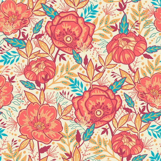
Oksancia – bright garden flowers
{click here to read more about Oksancia and her designs}
Have you ever wanted to design your own fabric? It’s a bit thrilling to see your very own pattern printed onto something that you can cut and sew into your very own original garment. With an ever-increasing number of online avenues to custom-print your original artwork and designs, it’s SO simple to just have a go and see if you like it. If you do like it and want to take it further, there are excellent tutorials and courses out there to to enable you to lift your work to higher levels, and I’ll be discussing some of the options in a later post.
But let’s start with the basics. You must have a good quality image if you want a good quality print. Even with the most fabulous design, you can still end up with a disappointing and ugly mess if you don’t address the technical aspects of your digital file first. This is a skill like any other, and as always, the more you practise the better you get at achieving exactly the look you’re after.
IMAGE SOURCES AND EDITING
Your digital files can come from several sources – an image from your digital camera; a drawing, painting or other 2D image that has been scanned in; or something created entirely onscreen through Photoshop, Illustrator, or any other image editing program (there are lots of basic free ones out there, including Picmonkey, Pixlr or Gimp). Please don’t be tempted to use other people’s artwork (as in Copy/Paste) even if you intend to alter it, as you still may be infringing copyright. There are lots of images out there in the public domain, free of copyright and available for everyone to use, but it is important that you check before using anything.
RESOLUTION
You need to get yourself familiar with a calculator and ruler here! The resolution of your file is very important. A very good quality print can be achieved at around 300 dpi (dots or pixels per inch, equivalent to about 118 dots per cm), but depending on what is being printed and what material you are printing onto, the fewer dpi you use, the more pixelated your image becomes. Some printers recommend your images should be at least 150dpi for a reasonable quality print onto fabric. The standard screen resolution on your computer is 72 dpi, which looks fine on your screen, but comes out distractingly pixelated and chunky when it is printed onto a surface.
IMAGE SIZE
First, you need to figure out how big you want your repeat to be. If you have small simple elements, your file doesn’t need to be large, but if you want something big, of course your file is much, much bigger. So using the resolution guide above, if you want to have a repeat of 12 inches wide at a resolution of 300 dpi, your image size must be 12 x 300 = 3600 pixels wide. If your repeat is 12 inches wide with a resolution of 150 dpi, then your file should be 12 x 150 = 1800 pixels wide; a 4 inch wide repeat at 150 dpi is 4 x 150 = 600 pixels wide, and so on.
CREATING A SIMPLE REPEAT
At its very simplest, you can load your image file onto a site such as Spoonflower, and and use their layout options to create a repeat. You can choose to tile (a straight up and down repeat), do a half-drop or a mirror repeat – each of these will alter the rhythm and look of your print.
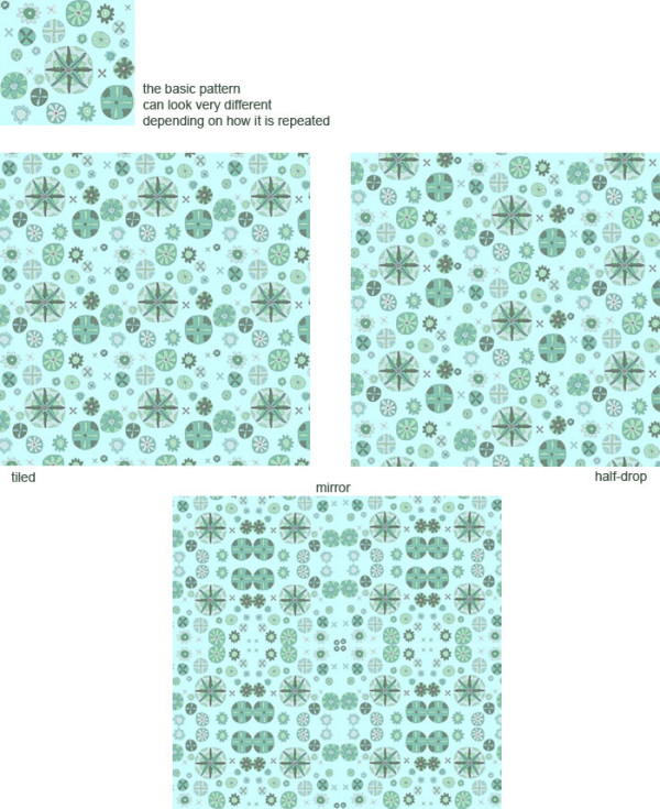
Sometimes these methods can create repeats that have distinct edges which are distracting, and can produce unpleasantly obvious repeats (for instance, if you are trying to create a scattered floral). One method of removing these edges from your work is to use the ‘Offset’ tool in Photoshop (many other programs have a similar tool), which moves your image up and across, so you can fill the resulting edges with continuing pattern. This tutorial on Design Sponge gives you a practical demonstration on paper so you can understand the principle, and an explanation for how to do it in Photoshop is found here. The most practical amount for offsetting is half the pixel width of your image.
CHECKING FOR ERRORS
When you upload your file to a site for printing, you need to remember that it is your responsibility to ensure the file you send is free of errors (and I’m not talking about computer glitch). For instance, check that there are no unintentional white spaces, that there isn’t a missing line of pixels, and that the colours you use on your screen will print in the colours that you intend.
You can tile your file on most image editing programs and check for errors that way (especially useful for finding a missing set of pixels, or mismatched lines at the edge of your design); getting a test swatch printed is useful for colour matching, and can also show up some of these errors (but not all, if your repeat is large).
That’s probably enough for now! In the next post, I’ll talk about colour (absolutely essential to getting the result you’re after, and there’s lots to know), as well as the various venues where you can have your deliciously juicy design printed.
Have you got any questions about image editing? Do you need info on how to do a particular task in Photoshop (or any other image-editing software)? I would love to hear about your experiences and problems. Leave me a comment below!
Cheers, Julie
Great blog post Julie – lots of helpful tips and tricks for those entering the gorgeous world of surface pattern design!
Thank you so much Sarah! Glad to help 🙂